Here Is a Sample Animation
But first, but me show you a level-3 subhead so you know what one looks like.
This Is a Level-3 Subhead
Yup, it's about the same size as normal text. On to the animation!
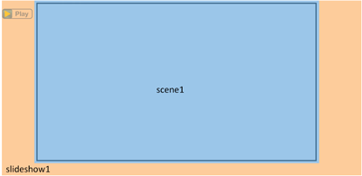
OK, there are few things going on here. First, we've got a div with the id 'slideshow1' and class 'slideplayer.' I've illustrated this container in the image to the right; the orange area represents the entire 'slideshow1' div. The id 'slideshow1' helps our JavaScript recognize it as an animation object. If you have more than one animation on a page, increment the number in the id +1 for each animation (for example, 'slideshow2,' 'slideshow3,' etc.).
The 'slideshow1' div has some inline CSS to set its height, width, and margins. I find it helpful to set the height a little bit taller than the height of the slides, just to give yourself some padding. (You can also set a bottom margin, but I find adjusting the height to produce more reliable layout results.) Margins will vary depending how you need to position the animation on the page.
The 'slideshow1' div also has a data-audio attribute, which links to the audio file that plays along with the animation. When you have actual audio available, you'll link to something like '/audio/g5/u0/G5_SG_U00_L0_p000_AnimationThing.mp3,' but if you need a placeholder for testing, you can find a bunch of files of different lengths in the main audio folder. (Thanks, Eric Rollence!)
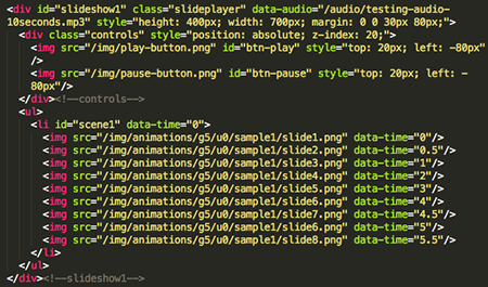
You'll also see a div with class 'controls' that contains two images. These images are the play/pause buttons for the animation. By default, the play button is visible; when you click it to start the animation, the pause button becomes visible. Each image uses inline CSS to set its position (the bit that says style="top: [some px]; left: [some px];"). You should use the position values to move the buttons up and down and side to side as needed. Make sure the position values in each image match, so the buttons will appear in the same position on the page.
Then you'll see an unordered list with one list item. The list item's id is 'scene 1,' and it has a data-time of 0. This id and data-time value will remain the same for every single animation. This is because each lesson animation has only one scene, and data-time="0" tells the animation to start at the very beginning of the audio.
Within the list item, you'll see a bunch of images with different data-time values. These are the individual slides that make up the animation. The data-time values indicate when they'll become visible as the animation plays; for example, slide 2 will appear half a second in, slide 3 appears 1 second in, and so on.
These next bits of info are really important!
- The first slide's data-time value should always be 0. If it's any other value, the first slide won't appear when the page is loaded.
- The first slide should always reflect how the animated area looks in the print book. Even if the animation storyboard calls for something to “fade in,” if the markup file shows an image in the animated area, that image needs to appear when the page is loaded.


