Lesson 3

Analyzing Data

Est. Class Sessions: 1–2

Developing the Lesson

Part 1. Which Graph Is Which

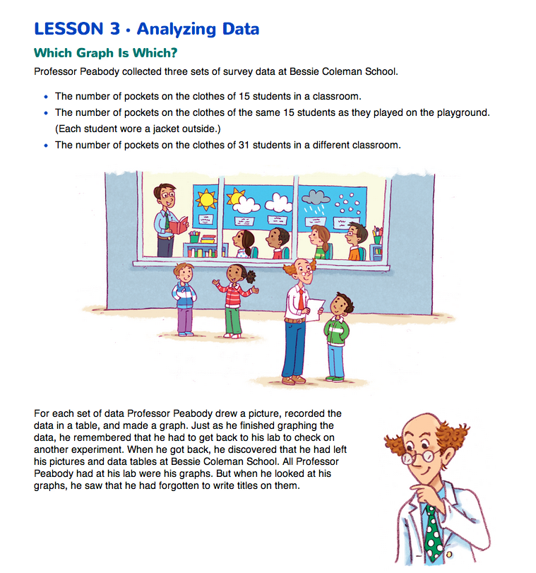
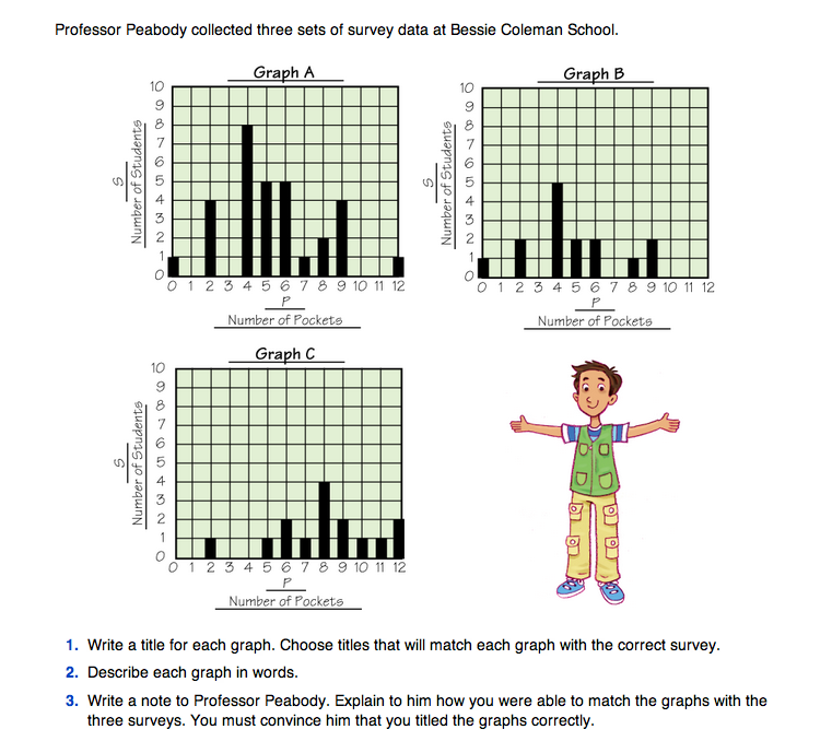
To begin this activity, ask students to read the description of Professor Peabody's problem on the Analyzing Data pages in the Student Guide. The professor has collected survey data on the number of pockets on the clothes of three groups of students, but he has lost his data tables and he forgot to title the three graphs. Ask students to work in pairs to complete Questions 1–3. In Question 1 students match the graphs to the descriptions of each survey and write a title for each graph. As students are working have them discuss how to interpret the graphs. Different students will have different strategies.

  • What did you notice about the bars on all three graphs? (Possible response: All three graphs have similar shapes. They all have one tall bar with shorter bars on both sides of the tall bar.)
  • How did the bars on each graph help you to decide which graph matched each of the three surveys? (Possible response: We saw that when we added the number of students represented by the bars in Graph A it added up to 31, so we knew this graph showed the pockets on 31 students in another classroom. Both Graph B and C showed data for 15 students, but in Graph C the bars are more to the right. This means that there were more pockets represented on the clothing. We decided that was because the students were wearing jackets, so Graph C matched with 15 students on the playground.)
  • What would be good titles for each graph? (Possible response: Graph A is about the 31 students so, a title could be “Number of Pockets on 31 Students in Class.” The tallest bar on Graph B shows 4 pockets is the mode, or most common number of pockets. On Graph C the tallest bar shows that 8 pockets is the most common number. Since students will have more pockets when they wear their jackets, the title for Graph C could be “Pockets for 15 Students on the Playground.” The title for Graph B can be “Pockets of 15 Students in Class.”)

In Question 2 students write a description of each graph. Encourage them to use the same language they used in Lesson 1 when they described the Eyelets graphs.

  • Are all the bars about the same height?
  • Are some bars taller than others?
  • Where are the taller bars?
  • Which bar is the tallest bar?
  • Are the bars spread out?
  • Are they close together?
  • If so, where are they located on the graph?

Question 3 asks students to write a note to Professor Peabody explaining how they matched the graphs to the three sets of data. Using the descriptions, they should compare the graphs and relate the shapes of the graphs to the three populations in the data collection.

Have students discuss how to interpret the graphs. Ask students to explain how they determined which graph fit with which survey. Different students will have different strategies. The Sample Dialog provides a model of a possible class discussion about strategies used to interpret and analyze bar graphs.

This Sample Dialog is a model of a class discussion about strategies used to interpret and analyze bar graphs.

Teacher: Jackie, how did you decide which graph went with each survey? What did you do first?

Jackie: The first thing I did was I could tell that Graph A must be the one with the other class, the one with the 31 kids.

Teacher: How could you tell that?

Jackie: Well, the bars are higher.

Teacher: What did that tell you?

Jackie: That there were more kids. You count each bar and add them. The tallest bar had 8 kids. Then the next two biggest bars, it's 5 and 5 so that's already 18 kids. There's still more bars, so you know it can't be the classes with 15 kids. It has to be the class with 31 kids.

Teacher: How did you decide which of the other graphs showed the data for the kids inside?

Linda: I looked at the biggest bars. In B, the biggest bar was 5 and in C the biggest bar was 4. So I said that B must be the outside because there are more pockets when they have their jackets on.

Teacher: In Graph B, Linda, what does the tallest bar tell you?

Linda: It says there were 5.

Teacher: Five what? Can you put a label on it?

Linda: Five pockets.....No, that's wrong, it is 5 kids. Five students with 4 pockets. I got confused.

Teacher: What does the tallest bar in Graph C tell you?

Linda: Four students have 8 pockets.

Teacher: So which graph do you think is the inside graph and which one is the outside? Can someone help Linda out here?

Frank: I think C is the outside graph. It has bars at the bigger numbers. Graph B doesn't even have bars at 10, 11, or 12, but C does.

Teacher: What do the 10, 11, and 12 across the bottom mean?

Frank: Pockets. It means that in C there were kids with 10, 11, or 12 pockets. Nobody in B had that many pockets. And you have more pockets when you put on your jacket.

Teacher: Very interesting. Did anyone do this a different way?

Jerome: I did. I looked at the smallest numbers.

Teacher: The smallest number of pockets or the smallest number of students? Show me on the graph.

Jerome: The smallest number of pockets. Here. [Jerome points to the left side of the horizontal axes.] In B there is one kid who has no pockets, but in C there is no one with zero pockets. That's because he put on his jacket and now he has pockets!

Teacher: Frank, what do you think about Jerome's strategy? What is similar to your strategy?

Frank: I thought it was good. We both looked at the numbers across the bottom and thought about how many kids were at each number.

X
SG_Mini
+
X
SG_Mini
+