Yellow
Green
Blue
Red
Magenta
Remove
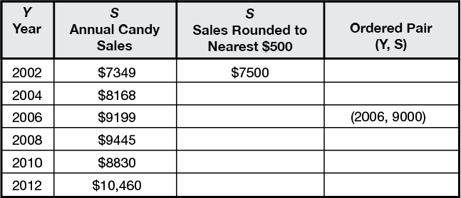
- The table shows the annual candy sales for the TIMS Candy Company for some of the years between 2002 and 2012.
- Copy the table. Complete the table by first rounding each price to the nearest $500 and then writing the ordered pairs using the rounded values.
- Use the ordered pairs to make a point graph using Centimeter Graph Paper. Plot the Year on the horizontal axis starting with 2002. Include the years through 2016. Plot the Sales on the vertical axis starting with $5000.
- If the points suggest a line, use your ruler to draw a best-fit line.
- In which year did the annual candy sales not go up? Did this data point change how you drew your best-fit line? If so, how did it change it? Explain.
- Use your graph to estimate the annual candy sales for 2009. Did you use interpolation or extrapolation?
- Use your graph to predict the annual candy sales for 2016. Did you use interpolation or extrapolation?
- The annual candy sales for 2013 were $11,205. Round $11,205 to the nearest $500 and then plot this point on your graph. Does this point fall above or below your best-fit line?
- Write the number 11,205 in expanded form and using words.


