


Yellow
Green
Blue
Red
Magenta
Remove
- The students in Mr. Moreno's class found it difficult to compare the two sets of data as David and Brandon reported it. They decided to make two graphs to display the data. How can you set up the graphs to tell the story of the data?
Mr. Moreno suggested that the students bin their data. He explained that when you bin data, you look at how data falls within equal intervals. For example, if you measure the height of each person in the class, you can group the data into bins such as 120–129 centimeters tall, 130–139 centimeters tall, 140–149 centimeters tall, 150–159 centimeters tall, and 160–169 centimeters tall. The number of heights in each bin is recorded.
- What intervals can you use to bin the life span data? Listing the ages on a separate sheet of paper may help you choose your bins.
- What are some reasons to bin data?
- The students binned the data and recorded the number of life spans in each interval. They knew they had a different number of people in each data set.
- How many life spans are in the 1858 data?
- How many life spans are in the 2014 data?
- What strategies can the students use to compare the data in the two sets?
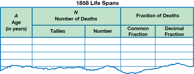
- Organize the 1858 data into a data table. Use the tables on the Life Spans Data Tables page in the Student Activity Book. To tally the data, list the ages on a separate sheet of paper. Then check off each number as you tally.
- What fraction of the people that died, died in each age group? Write a common fraction and a decimal fraction in the data table.
- Organize the 2014 data into a data table like you did in Question 5.