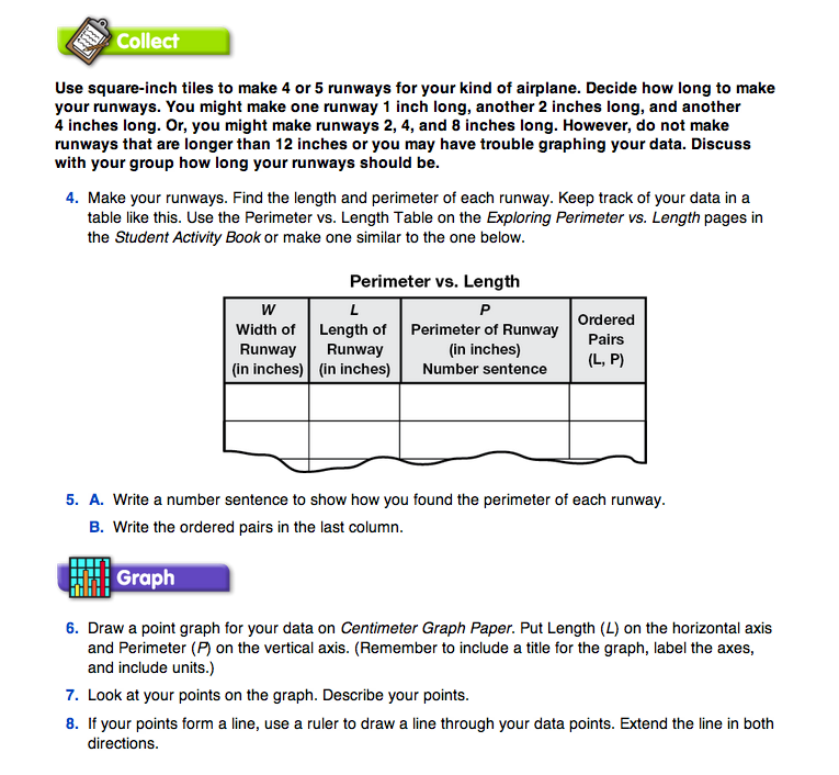
Ask each group to read the Collect section in the Student Guide before they start collecting their data. Questions 4–5A provide direction for completing the data table for this investigation. Students will not fill in the final column of the data table until they have collected all of their data and discussed how they will set up their graph.
Students may ask if they can choose lengths for their runways that are shorter than the width they were assigned. For the purposes of this investigation this is acceptable.
Students can now make their measurements and record the data in the table in the Collect section of the Exploring Perimeter vs. Length pages in the Student Activity Book.
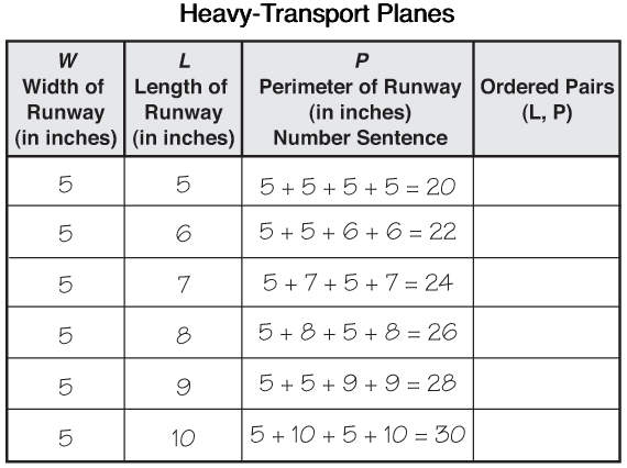
As the data accumulates, students should study their tables to look for patterns. Since the width of the runway is fixed for each group, students should begin to see a pattern when comparing the length and perimeter. The perimeter is twice the length (main variable) plus twice the width (fixed variable). Figure 3 shows sample student data for heavy-transport planes.

Bar Graphs and Point Graphs. Since a graph is a visual representation of a relationship between variables, the type of graph that is appropriate depends on the variables. In Unit 1, several investigations included a numerical and a categorical variable. For example, one investigation involved the number of students and the main interest. The values for the main interest are discrete; there are no values in between the different interests. A bar graph is the appropriate type of graph for representing this type of data.
In Perimeter vs. Length, students study two numerical variables. When both of the variables to be graphed are numerical, a point graph is often an appropriate way to represent the data. In this activity, both of the variables are numbers and the values are not discrete. That is, it is possible to have values between the data points, such as a runway that is 41/2 inches long. Therefore, it is reasonable to use points and lines, instead of bars, to represent the data. Drawing a line or a curve makes sense only when the data points form a pattern and when there are legitimate values between the data points.
Although other ways to display data (stem and leaf, pie charts, box and whiskers) have advantages in special circumstances, most data students gather in the elementary grades can be effectively displayed in either a bar graph or a point graph.