


Perimeter vs. Length Lab
Est. Class Sessions: 4Developing the Lesson
Part 3: Graph the Data
Set Up the Graph. Once the data has been collected, it should be displayed in a point graph. (See the content note for a discussion of different types of graphs.) If your students are new to Math Trailblazers, you will need to give them guidance in drawing their graphs.
Give students copies of the Centimeter Graph Paper Master to make their graph. Before they begin plotting their ordered pairs they will need to set up the graph.
Setting up a grid for graphing requires labeling and numbering the axes. An important question that arises is how to decide which variable to plot on each axis. When making a point graph, it does not really matter which variable is plotted on each axis. However, if several different groups are doing a similar investigation, it becomes difficult to compare data unless the groups set up their graphs in the same way. Therefore, scientists and mathematicians have developed several generally accepted conventions for deciding which variable to plot on each axis.
One such convention is to graph the variable with values that change and that the investigator chooses on the horizontal axis and the variable with values that the investigator finds out during the investigation on the vertical axis. Introduce students to this notion, and let them discuss which variable should be graphed on each axis.
Ask:
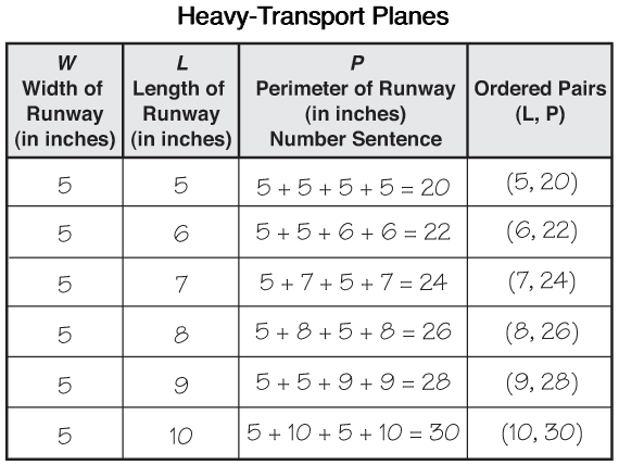
Before students graph their data they will need to write the ordered pairs that will be graphed. Since length is the variable on the horizontal axis, it will be the first value in each ordered pair and perimeter will be the second value. Use the data table for the light plane that you prepared as a class to demonstrate how to write ordered pairs before asking students to complete Question 5B in the Collect section of the Student Guide.

Students may ask why width is not one of the variables plotted on the graph. Remind them that width is a fixed variable.
So that the graphs for different planes can be compared, students should all scale the axes the same.
Ask:

Scaling the vertical axis, however, is not so straightforward.
Ask the class:
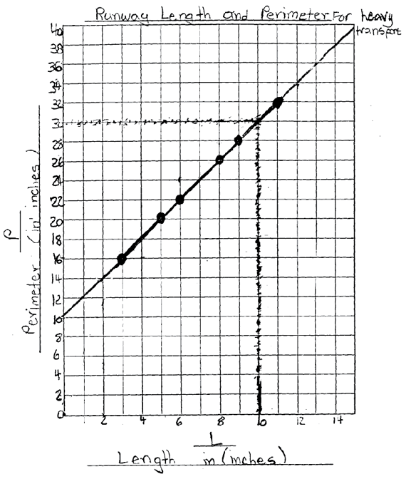
Plot the Points and Draw a Best-Fit Line. Questions 6–8 in the Graph section of the Perimeter vs. Length Lab pages in the Student Guide can be used to guide students as they graph their data. Question 6 directs students to plot their data points. After students have plotted their data points, they should see that those points form a pattern.
Question 7 asks students to describe the points on their graphs.
Ask:
If the points lie on a straight line, Question 8 asks students to use a ruler to fit a line through these points. This is called a best-fit line. This line should extend in both directions, intersecting the vertical axis at twice the width of the runway and continuing to the edge of the grid in the other direction. This line is useful for controlling error, identifying patterns, and making predictions. A sample student graph is shown in Figure 5.