Lesson 5

Counting by Fives

Est. Class Sessions: 3–4

Developing the Lesson

Part 2: Investigating the Samples

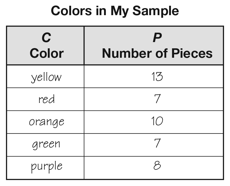
Collect Data. Walk around the room and let each student pair take a scoop of cereal from the bowl. Have the pairs collect the data on their own samples. Remind students to count the total, sort by color, count the colors, and record their data on the data table. Tell them they can look back at their pictures to remember these important steps. A completed sample data table is in Figure 3.

Use the data table in the Collect section of the Colors Lab pages to assess students’ abilities to collect and organize information using a data table [E8].

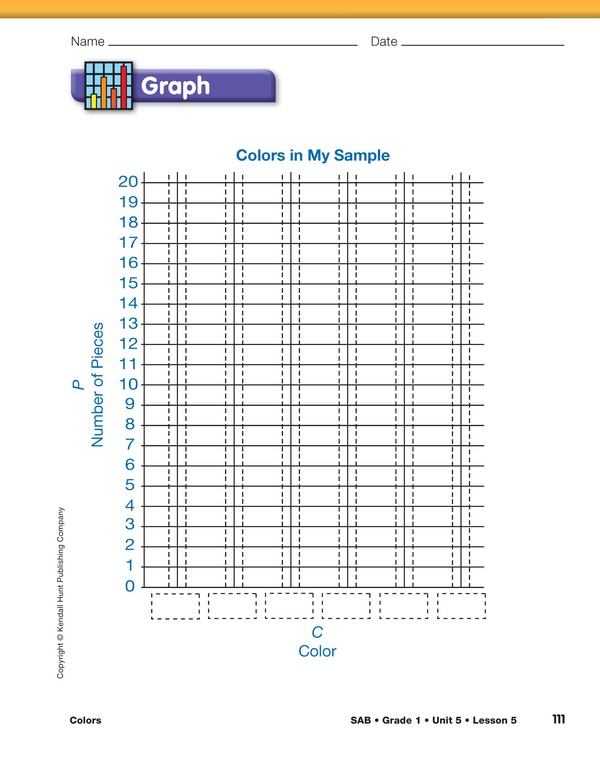
Graph Sample Data. The third step in the TIMS Laboratory Method is to use the information in the data table to create a graph. Make clear to students that a graph is like a picture of all the information they collected by counting the colors. It is a picture of what is on their data table. This is a key concept in this activity. See the Content Note.

Data Table. The data table is a numerical representation of the data; the graph is a pictorial representation of the same data. Often, patterns in the data emerge more clearly when shown on a graph. Point out how the axis labels on the graph correspond to the columns of the data table.

When filling in the data table and graph, students can use a crayon or marker of the appropriate color in place of writing the color name.

Display and direct students to the bar graph from the Graph section of the Colors Lab pages.

  • How is this bar graph the same as your data table? (Possible responses: They have the same labels, Color and Number of Pieces. There are numbers on both the data table and the graph. They have the same titles.)
  • What is this graph missing? (the bars; the names of the colors)

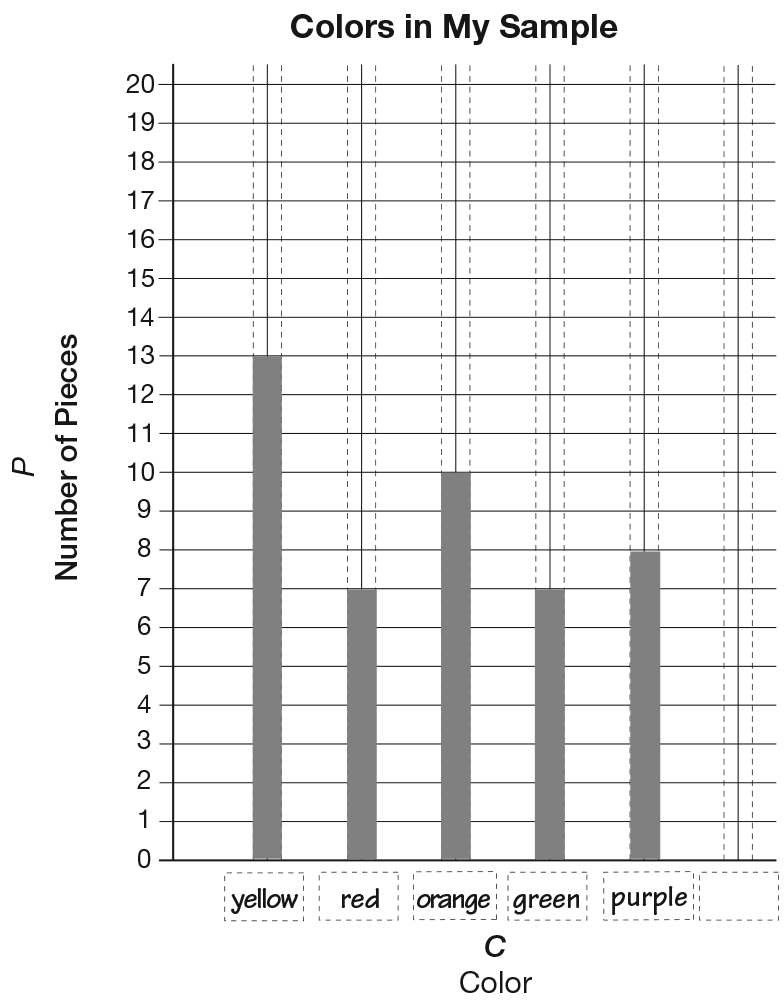
Using the display of the graph, fill in the names of the colors along the horizontal axis as students prepare their own. Use the totals recorded on your sample data table to demonstrate constructing a bar graph. Show students that the numbers on the data table tell how many spaces to color on the graph. Have students count with you as you color the bars on the graph. Point out that you are coloring between the dotted lines. See Figure 4. Draw attention to the fact that the bar of each color will go up only as far as the number for that color on the table.

  • Should the number of [yellow] pieces listed on the data table be the same as the number we show with the bar graph? Why or why not? (Yes. For example, if 13 yellow pieces are listed on the data table, then 13 spaces should be colored on the graph to show 13 yellow pieces. The information shown on the table should be the same on the graph because we are talking about the same sample.)

Interpret Sample Bar Graph. Ask students to use the graph to answer questions about the cereal sample, solve addition problems, and make predictions and generalizations about the colors in the cereal.

  • What does this graph tell you about the colors in my sample? (Answers will vary. Possible responses: You have 13 yellows. Or, you have more purples than reds.)
  • How many [yellow] and [orange] pieces do I have altogether? How do you know? (Possible response: I read the graph and added the number of yellow pieces to the number of orange pieces. I started at the number for yellow and counted on the number of orange pieces.)
  • How many more [oranges] do I have than [reds]? How do you know? (Possible response: I compared the bars and counted up from the shorter one.)
  • How does the graph show which color is the most common—the color you are most likely to see in my sample? (The color with the tallest bar shows the most common color.)
  • Does that match the information you learned from the data table? Does that make sense? (Yes; they are different tools but the data collected is the same.)
  • If I closed my eyes and pulled out a piece from my sample, predict what color it will be. (Answers will vary based on data.)
  • How does the graph help you make that prediction? (Possible response: You will most likely pick a most common color. The most common color has the tallest bar on the graph. You are not likely to pick a color that has a short bar on the graph because there are not many of that color in the sample.)

Allow students to use tools such as connecting cubes or ten frames as needed to help solve the addition and subtraction problems presented in the lesson.

Graph Data. Following the demonstration, have students complete their own bar graphs on the Colors Lab pages.

Use the graph in the Graph section of the Colors Lab pages to assess students’ abilities to make a bar graph to find information about their color sample [E9].

  • I wonder what the most common color would be if we put all the samples back in the bowl? How can we find out?

If no one suggests it, tell students they are going to put all of their data together to make a class graph. From the class graph, they will be able to determine the most common color. Distribute one 10-unit strip from the Color Strips Master for each color, plus a few extras, to each student pair. Show students the Colors in Our Class graph that you prepared and displayed before the lesson. See Materials Preparation.

Ask students to use either their data tables or graphs to color the strips to show the number of pieces of each color.

Divide and Conquer. In order to speed the preparation of the class graph, help student partners divide the tasks. Assign one of the students the job of coloring the [yellow, blue, and green] color strips for their class graph. Have the other student color the remaining bars.

Tell students to use a different strip for each cereal color in their sample and color the same number of spaces as pieces of that color in their sample. For example, if they have eight pieces of yellow cereal in their sample, eight spaces are colored yellow on a 10-unit strip. If students have more than ten pieces of a color, two 10-unit strips are taped together and then colored. The extra uncolored spaces should be cut off from the colored strip.

Collect the strips as students complete them. Attach the color strips to the Colors in Our Class graph you prepared while students work on the Explore section in Part 3 or before the next class session.

Glue or tape each color strip above the appropriate color label. Make sure the strips are taped above others of the same colors and that the strips touch each other. Leave no empty spaces and remember to leave the vertical axis unnumbered.

Make sure to leave adequate space for taping. Class strips can grow to six feet in length.

X
SG_Mini
+
A sample data table
X
+
A graph for the data in Figure 3
X
+