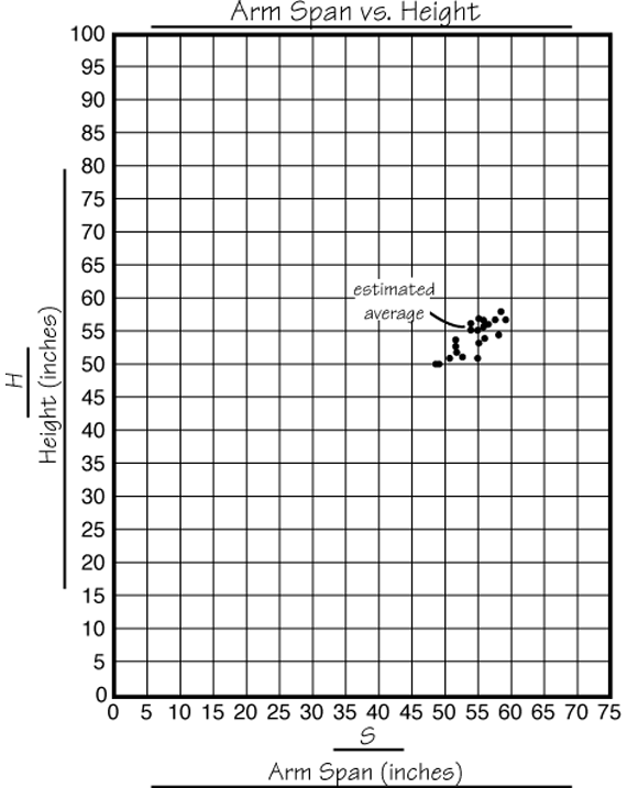
Arm Span vs. Height
Est. Class Sessions: 4–5Developing the Lesson
Part 4. Graph the Data
To reinforce graphing techniques, display the Point Graph: What's Wrong Here? Master in the Teacher Guide. This shows a student's graph that has several errors.
Ask:
Discuss with your class how the class graph should be set up.
Ask:
Some students in your class may be more familiar with graphing points and the TIMS Laboratory Method. Therefore, consider the following options when planning the next part of the lab.
Note that the graph for students' data will result in a cluster of points. Students do not need to fit a bestfit line through these points. Best-fit lines will be reviewed in a later unit.
Option A
Note: The instructions in the Student Guide describe this approach. If your class does not need practice plotting points, ask each student to plot only his or her data on a class graph. Students should work in pairs. After one child has plotted his or her point, the partner can check its placement. The class graph may be made into a display of the Centimeter Graph Paper Master or on poster-size graph paper. A sample graph is shown in Figure 4.
Option B
Have each student graph his or her group's data on a sheet of Centimeter Graph Paper. Encourage students to scale their vertical axes so that the data is spread out as much as possible. Numbering by fives usually works well to help spread apart the data. Students may label each point with initials. Group members should compare graphs to check where the points were plotted. After each student in the group has graphed the group data, individuals plot their own data on a class graph.
Option C
Make copies of the class data table and distribute one to each student. Then, each student graphs all of the class data. You can begin graphing some of these data points in class and then assign the remainder for homework. As a reference for class discussion, make a display from a copy of a student's graph or graph the data on poster-size graph paper.


