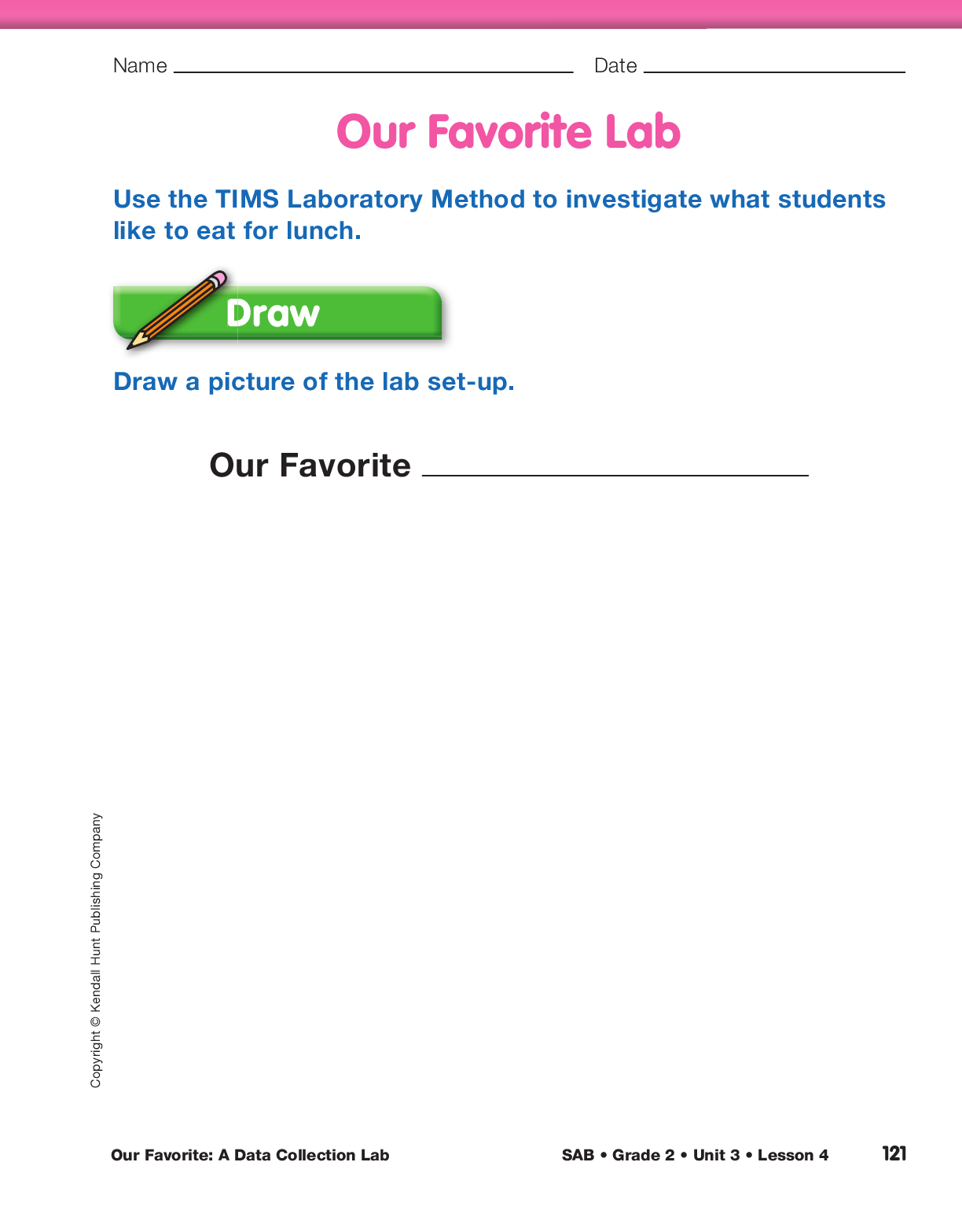
Draw the Picture.
Begin the lab by asking questions
about what students like to eat for lunch. The purpose
of this discussion is to determine what data is interesting
to your class. Encourage students to be specific—describing the kind of sandwich, their favorite pizza
toppings, the kind of taco, and so on.
Since students will work collaboratively in groups throughout
the year, introduce routines that encourage effective group
work. For example, to generate a list of possible foods to
study, groups can use a cooperative learning structure
known as Roundtable. One group member writes a type of
food—for example, pizza—at the top of the page. The other
members take turns listing things they could study about
people’s preferences for pizza. One student may list onion,
while another lists pepperoni. Whole class discussion can
incorporate reports from the groups.
After discussing what class members like to eat, create
a list of favorite lunch items such as pizza, tacos,
or sandwiches. Tell students they will conduct an
investigation. The class may decide to investigate
one of the following:
- our favorite sandwich (turkey, ham, peanut
butter and jelly, bologna, cheese, etc.)
- our favorite pizza topping (sausage, pepperoni,
mushroom, onion, etc.)
- our favorite taco (beef, chicken, steak, veggie, etc.)
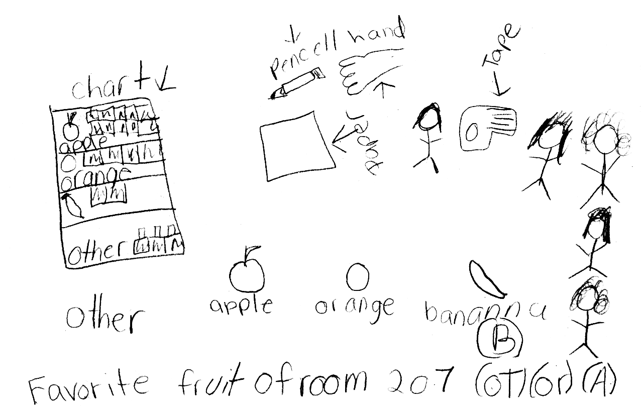
- our favorite fruit (pear, apple, banana, etc.)
Once students have selected a lunch item to investigate,
they will need to describe the variables they are
interested in. For example, if the class is interested
in types of sandwiches, students will need to decide
which types sandwiches will be listed in their survey
(e.g., ham, turkey, peanut butter and jelly, bologna,
cheese). Add these categories to the picture graph
you prepared. As you complete the first column,
explain that each student must choose from among
the items listed, so they should make sure the list is
complete.
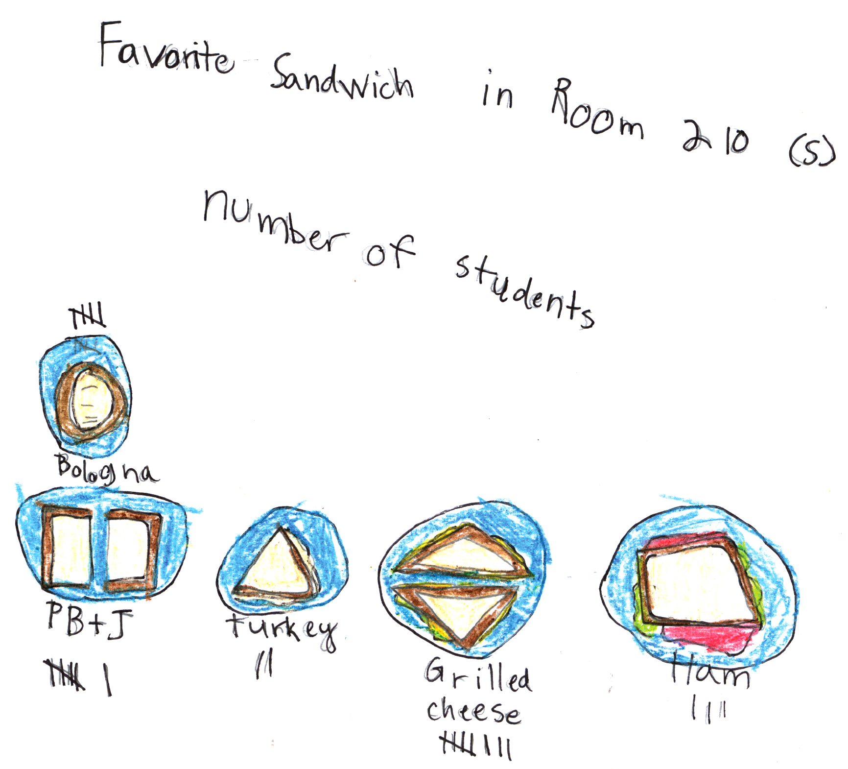
Remind students that scientists often begin an
investigation by drawing a picture of what they
are studying. You provided a picture for the Birth
Months lab in Unit 1 and modeled drawing a picture
for All Sorts of Buttons in Unit 2. This time students
will draw their own. Students should draw their picture
in the Draw section of the Our Favorite Lab
pages in the Student Activity Book. This picture
should indicate the type of lunch the class is studying.
It should also include the possible choices students can study. For example, if your class is studying
favorite sandwiches, a child may draw ham,
turkey, peanut butter and jelly, bologna, and cheese.
Since the study involves how many students like a
particular sandwich, the picture should include numbers.
For example, a child may draw 6 students who
like peanut butter and jelly and 3 who like ham. See
Figures 2 and 3 for sample drawings.
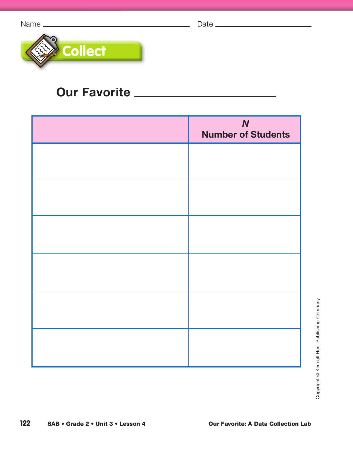
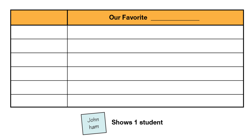
Collect and Organize Data. The second step in the
TIMS Laboratory Method is collecting and organizing
data. Give each student a square self-adhesive
note and ask them to record their name and their
favorite choice in that category (e.g., peanut butter
and jelly). Ask students to place their notes in the
appropriate columns on the picture graph. Add an
example below the picture graph so students know
what to write on their note. See Figure 1.
Ask students to record their favorite choice on a self-adhesive
note to avoid influence by their peers. The resulting
data is more interesting and a more accurate representation
of the student population.
After students have placed their self-adhesive notes
on the picture graph, ask them to record the categories
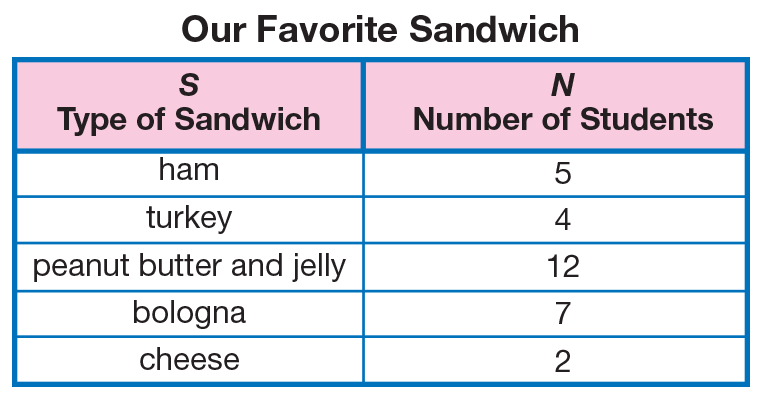
and the number of students on the Our Favorite _________ table in the Student Activity Book. See
Figure 4 for a sample data table.
Display the Our Favorite _______ table page from the
Student Activity Book. Label the first column with an
appropriate heading. It should describe what your
class is studying (e.g., Type of Sandwich, Pizza
Toppings, Kinds of Tacos).
Explore the Data in the Data Table and Picture
Graph. Use the data table and picture graph to pose
questions and problems such as the following. Be
sure to include problems that involve adding and
subtracting numbers.
- What do you notice about the data table? (Possible response: More people like peanut butter and jelly than cheese.)
- How many students’ favorite sandwich is [bologna]?
- Do more children like [bologna or turkey]?
- How many more students like bologna than turkey?
- How many like [ham, turkey, and bologna] altogether?
How do you know? (Possible response: I
added 5 ham, 7 bologna, and 4 turkey:
5 + 5 + 2 + 4 = 16.)
- How many like [peanut butter and cheese] altogether?
- How many did not choose [peanut butter] as their
favorite? How do you know? Did anyone figure this
out a different way? (Students may add the
non–peanut butter columns together or they may
subtract the number in the peanut butter column
from the total.)
- How can we find the total number of students surveyed? (Possible response: I added all the data by
finding the groups of fives and adding on the leftover.)
By finding the sum and comparing it to the class
size, students can check whether data has been
recorded for each student. Data tables can help
students record their data accurately. Checking for
accuracy and looking for patterns while gathering
and recording data are habits worth encouraging.
Graph the Data. Ask students whether they see any
patterns in the data table. Patterns may not be apparent.
Explain that when the data is graphed, it may be
easier to recognize patterns. Show a display of the Our
Favorite _______ graph on the Our Favorite Lab
pages. Ask students to refer to the data table and give
them a minute to think about how to label the graph.
See Figure 5 for a sample graph.
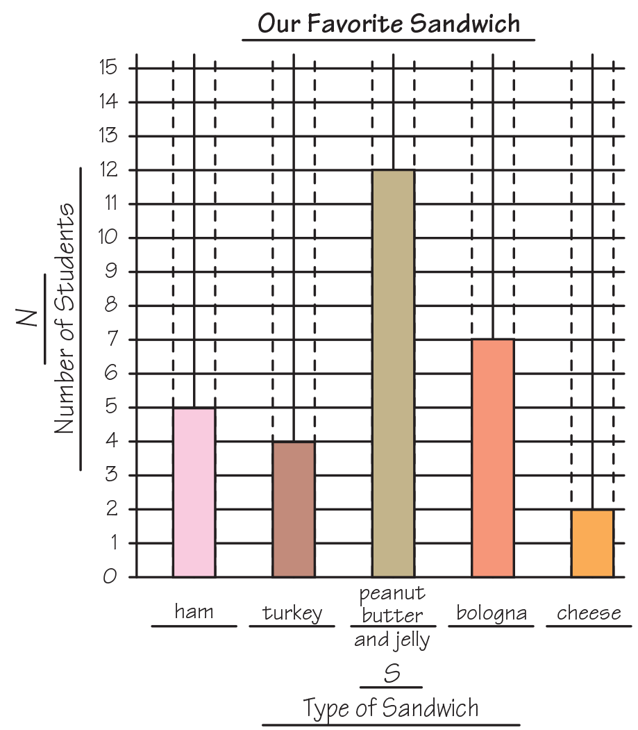
- If this is a graph of the data on our data table, what should the title be? (Our Favorite Sandwich)
Point to the horizontal line across the bottom and say:
- This is called the horizontal axis. What should this
label be? Take a hint from the data table. (The first
column in the data table, Type of Sandwich.)
- How should we label each of the bars? What do we
want them to show? (the names of our categories,
e.g., ham, turkey, peanut butter and jelly, bologna,
and cheese)
Point to the numbers on the vertical axis along the left
side of the graph and say:
- We call this the vertical axis. What are these numbers for along the vertical axis? (Possible responses:
They tell us how high to draw the bars; to show how many students like each sandwich.)
- What should the label be? What is left on our data table? (Number of Students)
Fill in the appropriate labels on the display as students
do the same on the graph on the Student Activity Book
page. Ask a volunteer to shade in the first bar on the
display using the data given in the data table. Draw
attention to filling in the space between the two dotted
lines and shading to the number given in the data table.
Students complete their own graph. Ask one student to
complete the graph on the display.

While labeling the graph on the display, include the letter S
(or whatever is appropriate to the title of your particular
graph) for the horizontal axis and the letter N for the vertical
axis. There is no need to talk about or explain the S and N
labels now, unless students ask about them. If they do ask,
turn the question around and ask them to tell you what they
think the letters mean. They have seen them before on earlier
labs. These are variables and stand for the two kinds of data
in the graph, i.e., S stands for the types of sandwiches and N
stands for the number of students. For now, it is sufficient
that the students become used to seeing the letters on their
graphs and understand that they relate to the data being
presented.
Explore the Data on the Table and Graph. The
fourth step of the TIMS Laboratory Method is exploring
the data. Students have three representations of
the same data: data table, graph, and picture graph.
Emphasize that answers to questions about the data
can be found in more than one way. Point out that
solutions by different methods should agree: If the
graph shows that ten people prefer peanut butter and
jelly and the data table shows twelve, something is wrong.
Discuss and explore the data on the graph and table.
Pose questions similar to those asked about the data
table.
The responses use the sample data in Figures 4 and 5:
-
Which [sandwich] is most popular? How can you
tell by looking at the table? Looking at the graph?
(Possible response: Peanut butter and jelly; looking
at the table, 12 is the highest number in the
Number of Students column; on the graph, it’s
the tallest bar.)
-
Which [sandwich] is least popular? How can you
tell? (Possible response: Cheese because it’s the
shortest bar on the graph.)
-
Which tool makes it easier to tell the most or least
popular—the table or the graph? Why do you think
so? (Possible response: It’s easier on the graph
because you can see the tallest and shortest bars
more easily than finding the numbers on the
table.)
- Altogether, how many students chose either [ham
or turkey]? How do you know? (Nine; I added 5
for ham and 4 for turkey, 5 + 4 = 9.)
- Did you use the table or the graph to answer the
question? Which do you think makes it easier to
answer that question? Why do you think so?
(Possible response: I used the table. It was easier
because the ham and turkey are together and the
numbers were easier to find than reading the bars
on the graph.)
- Which [sandwich] did [four] people choose as
their favorite? (turkey)
- Which [sandwich] is more popular—[ham or
cheese]? Looking at the graph, how do you know?
Looking at the table? (Possible response: Ham;
the bar is taller than the bar for cheese on the
graph. Looking at the table, 5 for ham is greater
than 2 for cheese.)
- How many more students like [peanut butter than
bologna]? How do you know? How can you use
the graph to find out? (5; I looked at how much
taller the peanut butter bar was than the bologna
bar. I counted 5 spaces from the top of the
bologna bar to the top of the peanut butter bar.)
- How might the graph look different if another second-grade class joined us in the experiment?
(Possible responses: There would be the same
number of bars but they would be taller; the
graph may have the same shape or may have a
different shape if the other class preferences were
a lot different.)
- I am going to make everyone’s favorite [sandwich].
I will put the [ham and turkey] in one box and the
[peanut butter and jelly] in another box. Which box
has more [sandwiches]? (The peanut butter and
jelly box) How many more? (3 more sandwiches)
How did you find out? (I know because there are
12 peanut better and jelly sandwiches and 9 ham
or turkey sandwiches and 12 − 9 = 3.)
- If one of our family members visits our classroom
and wants to know how many students are in the
class, how could he or she use the graph to find
the answer? (Possible response: He or she has to
look at each bar and add all the numbers at the
top together because everyone in the class is represented
on the graph.)
Compare Data Table and Graph. Have students
reflect on the process of the investigation and compare
their use of the data table and graph.
-
How did the table and graph help us investigate
our class’ favorite [sandwich]? (Possible
responses: They helped us organize the data
about each kind of sandwich so we didn’t get
mixed up. These tools helped us remember all the
information. We could check easily to see if
everyone in the class was represented on the data
table. The graph made it easy to compare information
about the different sandwiches.)
- How are the table and graph alike? (They both
help organize information. They both have the
same labels. They both tell the same information.
The information in each should match.)
- How are they different? (The data table uses numbers.
The graph uses bars and makes a kind of
picture of the data to see patterns easily.)
- Is it always easier to use one tool over the other to
answer questions about the data? Explain your
thinking. (Possible response: No, sometimes it’s
easier to get information from the table, and
sometimes it is easier from the graph. It depends
upon the information you need to find.)
- Can you give me an example of when it might be
easier to use the graph? (Possible response:
When I want to find the most liked sandwich, it
is easier on the graph because I can find the
tallest bar more easily than looking for the highest
number on the data table.)
- Can you give me an example of when it might be
easier to use the data table? (Possible response:
When I want to find out how many students are
in the class it is easier on the data table because I
could just add up all the numbers in the Number
of Students column. On the graph I have to read
the top of each bar and then add.)