


Predictions from Graphs
Est. Class Sessions: 2Developing the Lesson
Part 2. Using Best-Fit Lines and Making Predictions
Use Best-Fit Lines to Make Predictions. On the Using Best-Fit Lines pages in the Student Activity Book, students will find eight point graphs.
Have students work in pairs to answer Questions 1–8. Encourage students to describe patterns in terms of lines or curves.
Circulate among students using the following discussion prompts as a guide:
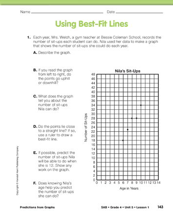
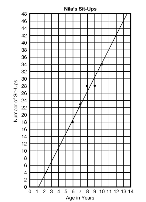
Use the graph in Question 1 to demonstrate drawing a best-fit line. Use a display of the Nila's Sit-Ups Master. See Figure 1. Students can experiment with various angles using a ruler (preferably a clear ruler). As a rule of thumb, to fit a line, try to get about as many points above the line as below it. Once they have decided on the placement of the line, students should draw it using a pencil and a ruler. They should extend the line in both directions. Each student may draw the line a little bit differently, which will result in different predictions. The lines and predictions, however, should be relatively close.
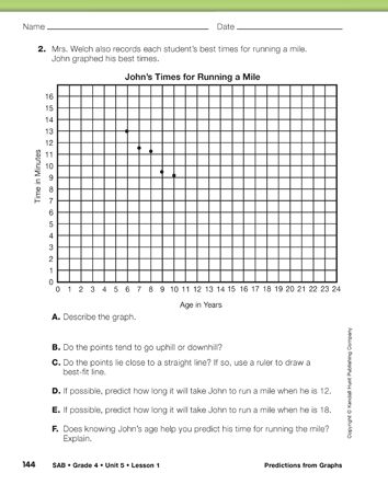
The points on the graph in Question 2 lie close to a line that goes downhill since John's times for running the mile decrease as he gets older.
Question 2D asks students to use extrapolation to predict John's time for running the mile when he is 12. Using the best-fit line they will likely predict his time to be about 7 minutes. In Question 2E, students are asked to predict the time it will take John to run a mile when he is 18. If they use the best-fit line, they may say his time will be about one or two minutes. However, this is not a reasonable prediction.

Question 2F asks if knowing John's age helps predict his time for running a mile. Knowing his age helps only if we are talking about ages within or near the data points. As shown in this situation, extrapolating far beyond the actual data points is often unreliable and may be unreasonable.
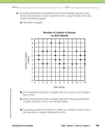
The points on the graph in Question 3 do not form a line. There is no relationship between the number of letters in a person's name and that person's birth month. It would not make sense to draw a line on the graph. Although students may predict that the number of letters in a person's name is between three and nine letters, knowing the person's birth month will not help make a better prediction.
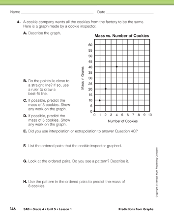
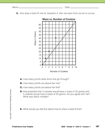
The points on the graph in Question 4 lie directly on the line. Predictions can be made with certainty, either by interpolation or by extrapolation. This is because there is a clear multiplicative relationship between the number of cookies and the total mass. Each cookie has a mass of 10 grams, so the mass of 5 cookies will be 10 × 5, 50 grams. If students write the ordered pairs correctly, they should be able to see this relationship.
In Question 5, a student makes a common error when drawing a best-fit line. She simply draws a line from the lower left corner to the upper right corner, regardless of where the points lie.
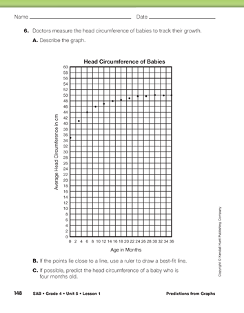
The points in the graph in Question 6 do not suggest a line, but they do form a curve. Even though it would not make sense to draw a best-fit line, it is possible to use the graph to predict the head circumference of a baby if you know the baby's age.
Ask:
Question 7 provides more practice and ties the data points on the graph to a data table and ordered pairs.