


Predictions from Graphs
Est. Class Sessions: 2Developing the Lesson
Part 1. Predictions from Graphs
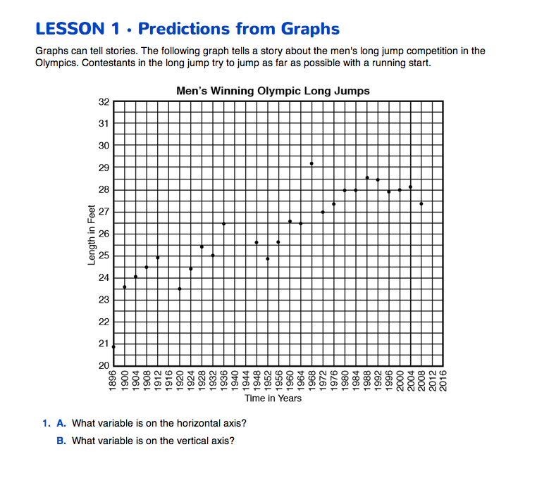
The Graph's Story. Display the Olympic Long Jump Master, as you begin a discussion about the Predictions from Graphs pages in the Student Guide. The graph charts the winning long jumps in the Olympics from 1896 to 2008. Use Questions 1–2 to introduce students to the data in the graph.
When describing a graph, students often say that the graph “looks like mountains” or that the graph is “bumpy” (Question 3).
Question 4 asks about the winning jump in 1968, when Bob Beamon jumped more than 29 feet, more than two feet longer than any previous jump. Following the pattern of the data points since 1896, we can predict that Beamon's record might be broken by 2016. However, just considering data points since 1972, we may not make this prediction. See the content note for more information.


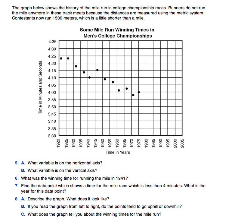
The second graph shows winning times for the mile run in the Men's National Collegiate Championships from 1921 until 1975 when the race became 1500 meters instead of the mile. Display the Mile Run Master to begin the class discussion. Questions 5–7 are provided as a check to see if students can read the graph. Be sure they can read the minutes and seconds on the vertical axis before continuing the discussion.
In Question 8, students are asked to describe the graph. Students should recognize that the data points from 1920 to 1975 trend down showing that winning times for the mile run got faster.
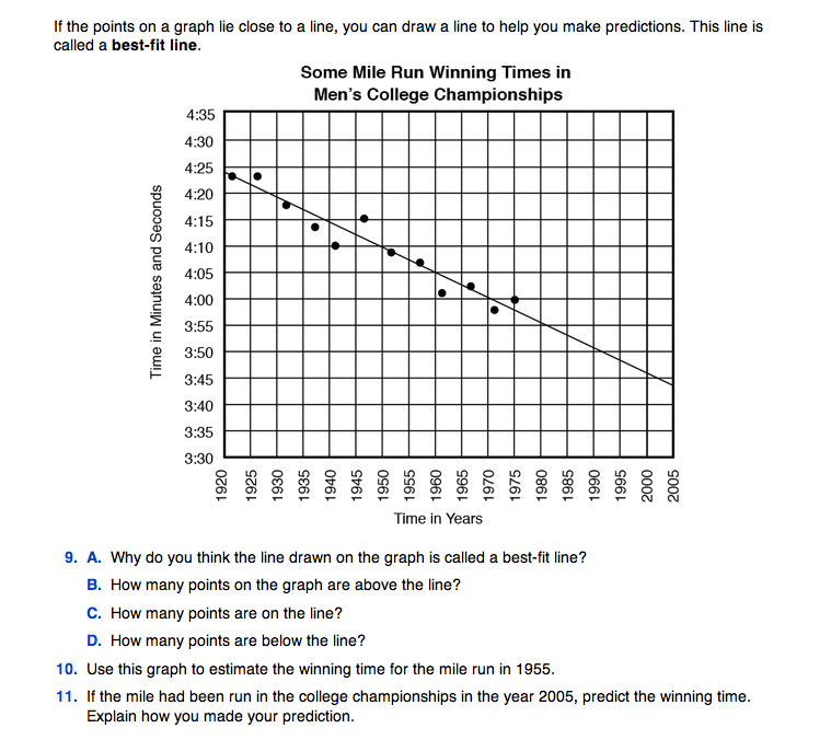
Draw a Best-Fit Line. A best-fit line is a line that fits the points on the graph as closely as possible. Demonstrate on the display of the Mile Run Master where to place the best-fit line, fitting the visible pattern made by the points. Any straight edge can be used such as a clear ruler, a piece of spaghetti, or a straight piece of string. Questions 9A–9D emphasize that a best-fit line:
- is a straight line (i.e., a best-fit line is not a crooked line that connects the points)
- fits the the points as closely as possible
- usually will have about the same number of points above it as below it
- may or may not go through many of the points.
Make Predictions. Question 10 asks for an estimation of the winning time in 1955. There is no data point here, but following the best-fit line, we can estimate that the winning time that year was probably between four minutes and five seconds and four minutes and ten seconds. Question 11 asks for a prediction for the winning time in the year 2005. This is harder to do since it is outside the range of our data. The pattern of the points suggests that if the mile had been run in 2005, the winning time would have been near three minutes and 45 seconds. Other predictions are possible depending on the interpretation of the data.
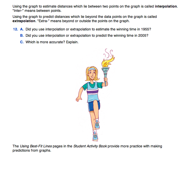
Question 12 asks students to use the terms interpolation and extrapolation. Estimating data points that lie within the data, as in Question 10, is interpolating. Predicting data points that lie beyond the range of the data, as in Question 11, is extrapolating.
Ask:
Ask students to estimate and predict a few more data points on the graphs in the Student Guide and ask them to identify whether they are using interpolation or extrapolation to find their answers.
When answering Question 12C, it is important that students recognize that extrapolation is usually riskier since we cannot really know what will happen. Our prediction for the year 2005 may not be accurate since 2005 is so far beyond the range of the data.