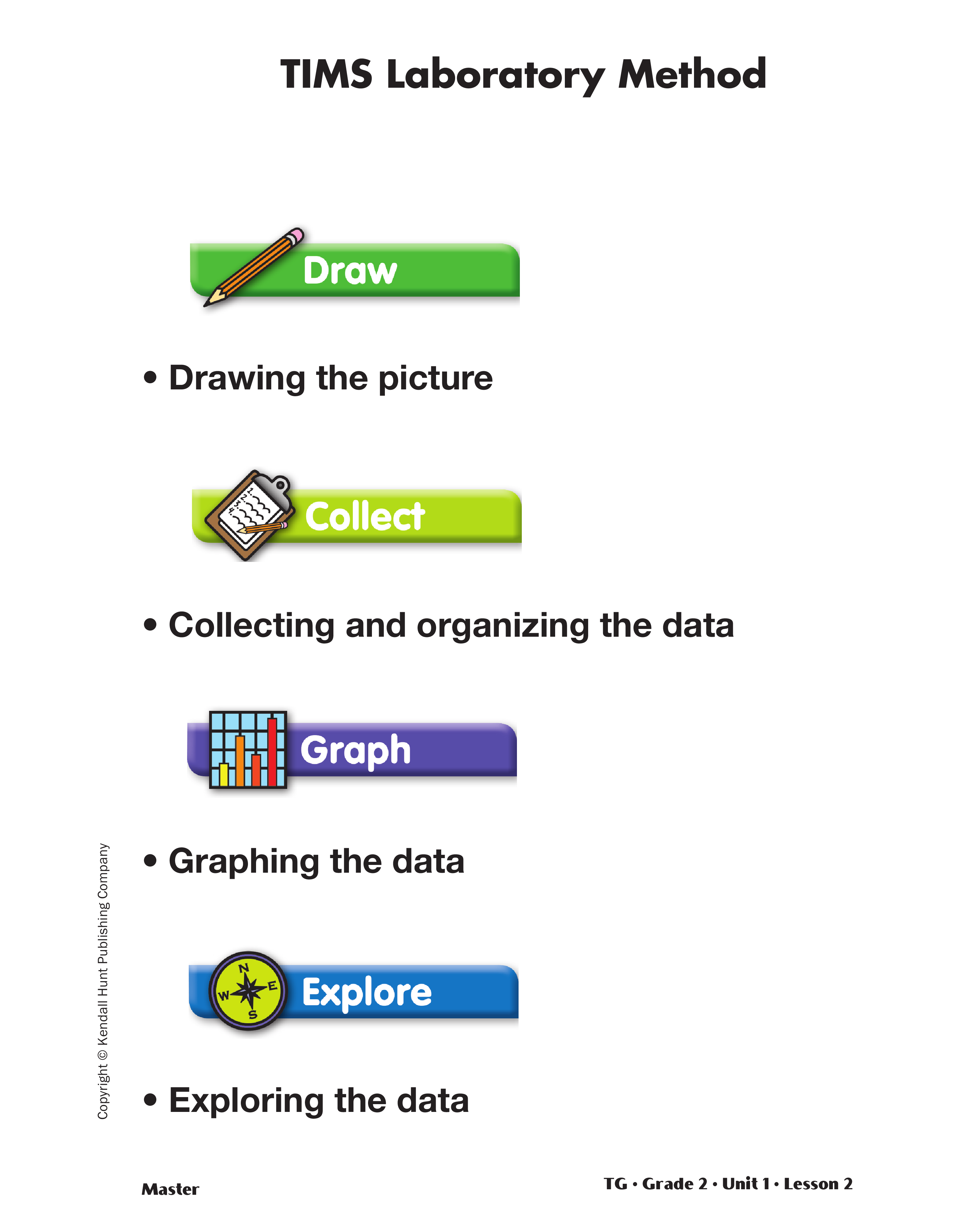
Launch the Birth Months Lab. The TIMS
Laboratory Method unfolds in four steps:
- Drawing the picture
- Collecting and organizing the data
- Graphing the data
- Exploring the data
Begin the lab with a short discussion on birth
months. Ask a few students what their birth month
is.
After students have shared their information, ask
the following:
- If we make a list of everyone's birth month, which
month do you think will have the most birthdays?
- Which month do you think will have the least birthdays?
- Do you think there will be a month with no birthdays
from our class?
- What if we make a list of the entire school? Do
you think there will be a month that will have no
birthdays? Why or why not?
Tell students the class is going to conduct an investigation
to find how many students were born in each
month. In this investigation, students will use a
method that is similar to the way scientists work when
they do experiments. Students who used Math
Trailblazers in First Grade should be familiar with
this method. Briefly review the four steps using a display
of the TIMS Laboratory Method Master.
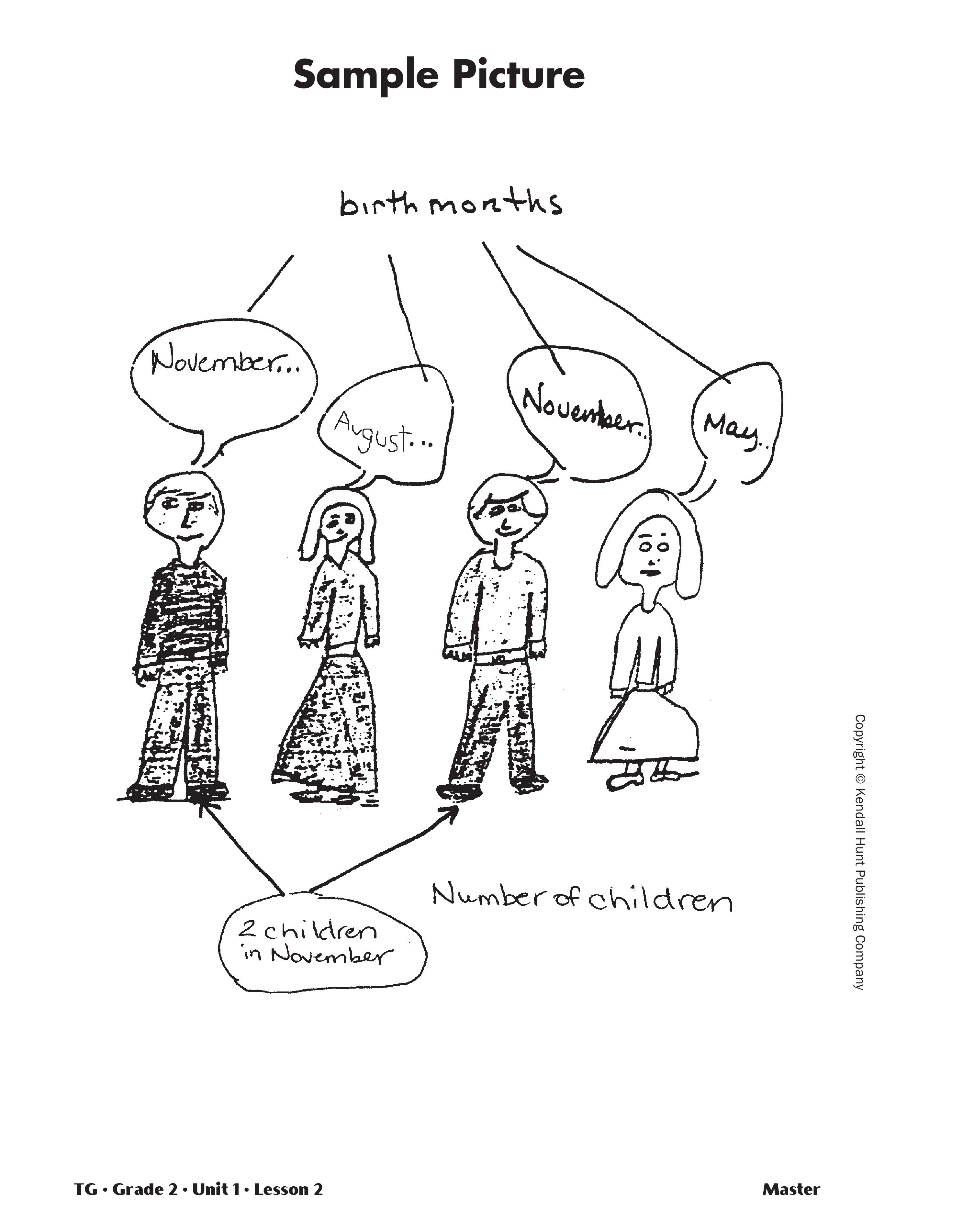
Draw the Birth Months Lab Picture. Scientists
often begin experiments by drawing a picture showing
what will be studied. Give students who had
Math Trailblazers in First Grade the opportunity to
share their experiences with the TIMS Laboratory
Method. In future units, students will draw their own
pictures. For this introductory lab, show students the
Sample Picture Master. Explain that the picture illustrates
what they will try to figure out in this lab.
Point out how Birth Months and Number of Students
are shown in the picture.
Collect and Organize the Birth Months Data. Explain that the second step is collecting data and
organizing it in a data table.
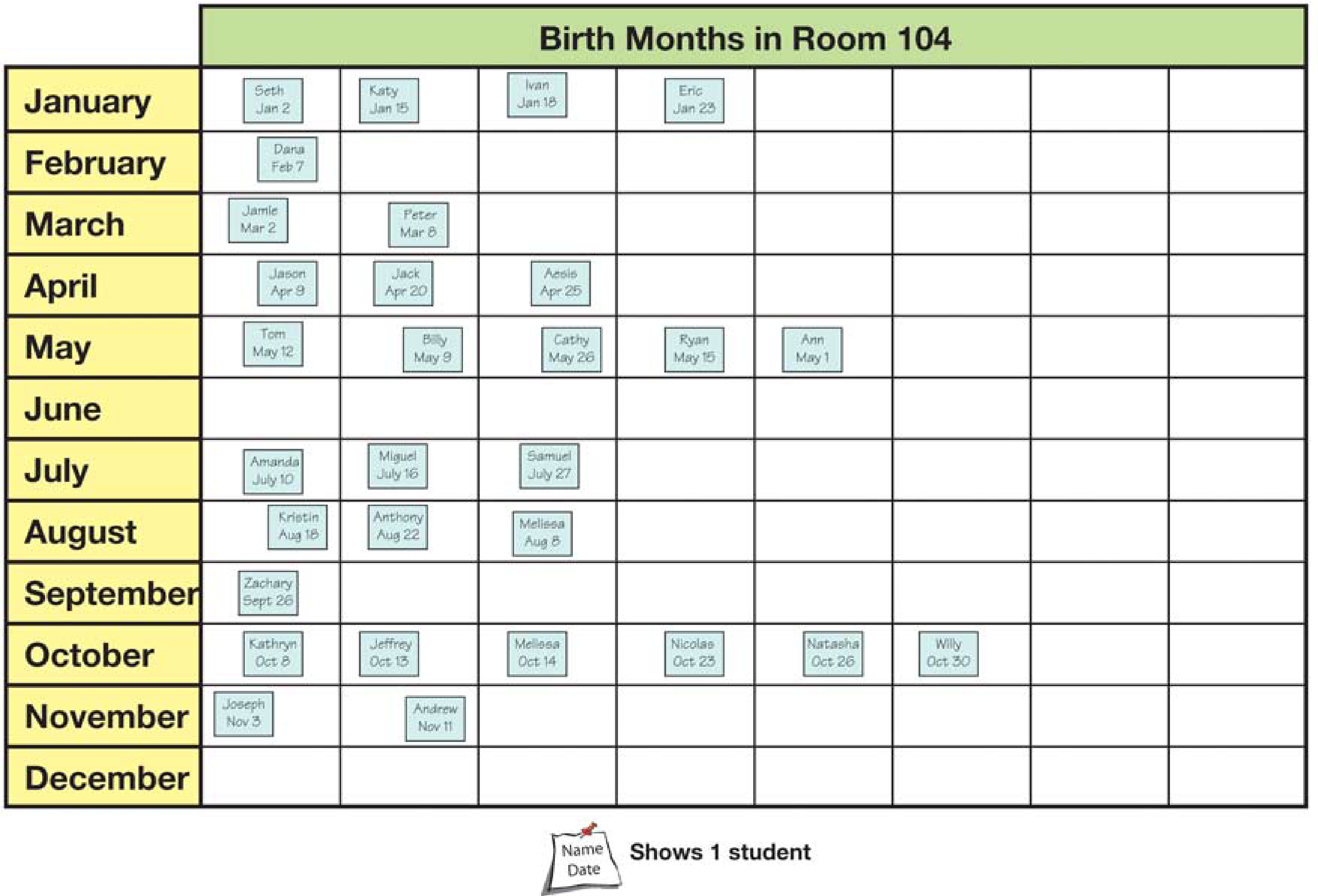
Collect Birth Months Data in a Picture Graph. Collect Birth Months Data in a Picture Graph.
Give each student a small self-adhesive note. Ask
them to draw a picture of their face and to record
their name and birth month on the note. Show students
the blank picture graph you prepared. Point out
the 12 months of the year are shown in the first column
of the blank picture graph. To collect data, ask
the students with a January birthday to stand and
place their completed self-adhesive notes next to
each other on the picture graph. Continue this process
until data for every each month is recorded. Tell students
a picture graph is a graph with pictures.
Discuss the data using questions similar to those that
follow. Student responses are based on the sample
data in Figure 2.
- What information can you learn from the picture
graph? (Answers will vary. Some possible
responses: the month with the most/least number
of birthdays; the number of students with a birthday
in a given month)
- How many students have birthdays in April? (3)
- How did you find out? (Possible response: I
counted the number of notes by April.)
- How many students have birthdays in December?
(0)
- How many students have birthdays during the first
6 months of the year? (15 students)
- Which month(s) has the greatest number of birthdays?
(October)
- How did you find out? (Possible response: I looked
for the month with the largest number of notes.)
- How many students reported their birth month on
the picture graph? (30 students)
- How did you figure that out? (Possible response: I
counted all the notes on the picture graph.)
- Is this the same number of students in the class?
(Possible response: It should be, if all the students
in the class reported their information on the picture
graph.)
By finding a sum and comparing it to the number of
students in the class, students can check whether the
data is accurate.
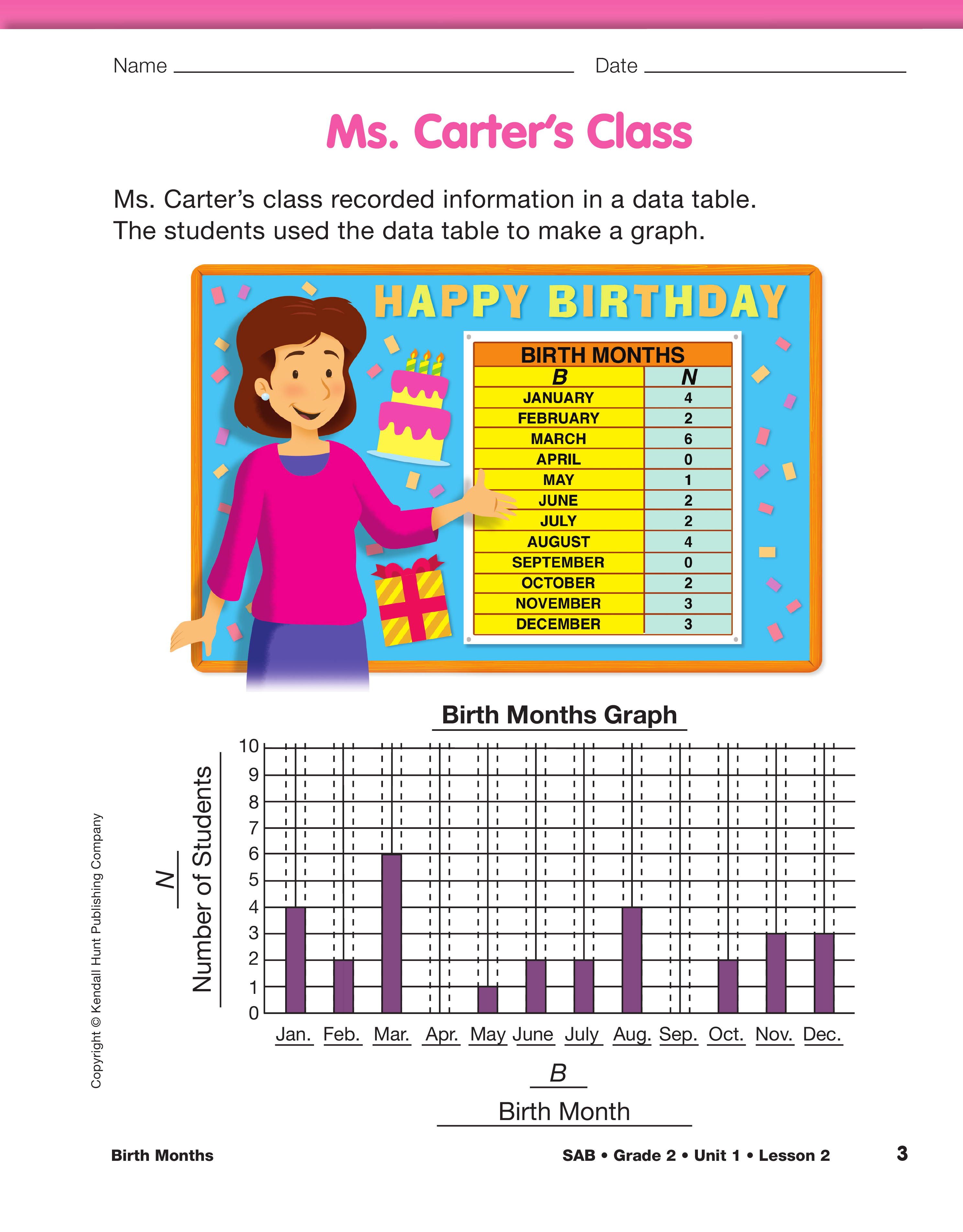
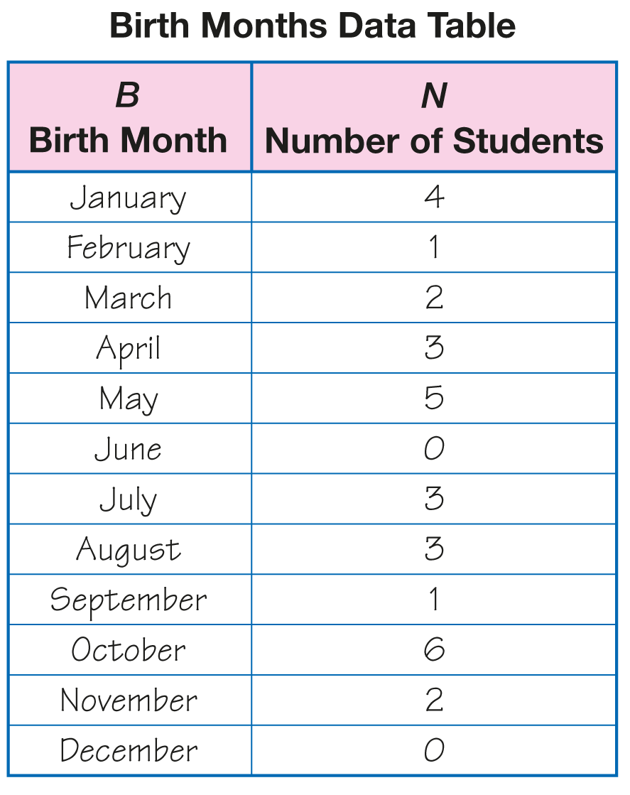
Organize the Birth Months Data into a Table. Display the Birth Months Data Table Master. Point
out the labels for the two columns as shown in
Figure 3. Tell students that the information can also
be organized into a data table. Ask a student to count
the number of students with birthdays in January and
then record the information in the data table.
Continue this process until all the data for each
month is recorded.
Looking at the data table, discuss the data again
using questions similar to the following.
- How many students have birthdays in April?
(3 students)
- How many students have birthdays in May?
(5 students)
- Which month(s) have the least number of birthdays?
How do you know? (June and December
because they both have zero birthdays.)
- What does it mean to have a zero next to a month?
(It means that no one has a birthday in that
month.)
- How many students have birthdays during the last
six months of the year? (15 students)
- How did you figure that out? (Possible response:
I added up all the numbers for the last six months
of the year.)
- You now have two ways to look at the birth month
information. Which do you like better? Why?
(Possible response: I like the picture graph. I can
see where the most and least are very easily; I
like the table because I can see the number of
students in a month without counting. I just have
to read the table.)

To encourage students to see the advantages and
disadvantages of different representations, students are
asked to make multiple representations: picture graphs, data
tables, and bar graphs.
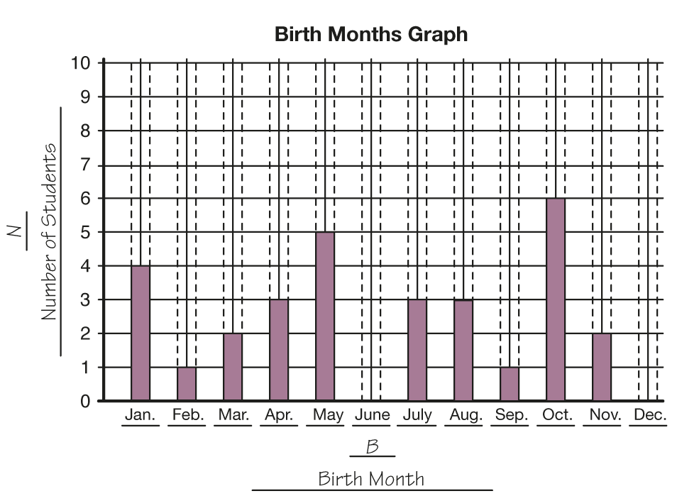
Make a Bar Graph of the Birth Months Data. Ask
students if they see any patterns in the data table or
picture graph. Patterns may not be apparent. Explain
that one tool that scientists use to help see patterns in
data is a graph.
Graphing the data is the third step in the lab procedure.
Use a display of the Birth Months Graph
Master to graph the data.
- Look at the Birth Months Graph. Notice it has a
title at the top.
- Notice the label, Birth Month, at the bottom. Where
is the same label on the data table? (at the top of
the first column of the data table)
- Notice the label, Number of Students, on the left
side. Where is the same label on the data table?
(at the top of the second column)
- The numbers along the left side help us read
the graph.
Note that the bars should be placed on the vertical lines
rather than between them. This helps students develop a
correct mental model of the number line (with the numbers
being represented as points on the line, not the spaces
between the points). It also leads to the correct method of
plotting points on a point graph.
Demonstrate using the data table to complete the
graph. Show students that they shade the bars
between the dashed lines. Ask volunteers to shade
some of the bars. Figure 4 shows a sample graph.
After recording data for 2 or 3 of the months, ask:
- Why did I fill in the bar for January the way I did?
(You made your bar stop at the number that is on
the data table.)
- How do you know that I've filled in the bars on the
graph correctly? (We can check the number on
the data table. They should be the same.)
- Will all of the bars on the graph be the same? Why
or why not? (No. Only the months that have the
same number of birthdays will have the same
size bar. All of the numbers on the data table are
not the same.)
The class graph may have an unequal distribution since it
includes data from a small sample. By collecting data from
several classes, the bars will probably even out.
Complete the graph allowing students to take turns
filling in the bars.
Looking at the bar graph, discuss the data again
using questions similar to the following:
- Look at the Birth Months Graph. How is it like the
Birth Months Data Table? (Possible response:
They have the same labels: Number of Students
(N) and Birth Month (B). They have the same
title: Birth Months. They show the same number
of birthdays for the months.)
- How are they different? (Possible response: The
graph looks like a picture, and the data table is
mostly words and numbers. The numbers show
the birthdays for the months in the data table and
the bars show them in the graph.)
- How do you know that the data in the table
matches the data in the graph? (The number of
students in each month on the table should be the
same as the heights of the bars on the graph.)
- How many students have birthdays in November?
(2 students)
- How many students have birthdays in the summer
months: June, July, and August? (6)
- How did you figure that out? (Possible response: I
looked at the height of those bars and added them
up.)
- How is reading the bar graph similar to the data
table? (Answers will vary. Possible response: I
can see the number of students in a month without
counting.)
- How is reading the bar graph similar to the pictograph?
(Answers will vary. Possible response: I
can see the smallest number of students and
greatest number of students easily because the
data is pictured.)
Explore the Birth Months Data. The fourth step in
the lab procedure is exploring the data. The class has
three representations of the same data: a picture
graph, a data table, and a bar graph. Emphasize that
answers can be found in more than one way and by
using more than one representation. Encouraging
multiple solutions lets every student participate. On
the other hand, point out that solutions by different
methods should agree. If the graph shows that
six people have birth dates in February and the data
table shows that there are only four, something is
wrong.
Ask questions similar to to the following using your
class data. Sample student responses that follow the
prompts are based on the data in Figure 2.
- Which month is the most common birth month?
That is, which month(s) have the most birthdays?
How do you know? (October has the most the month birthdays
because it has the tallest bar or
shows the largest number of students.)
- How many birthdays were in that month? (6)
- Which month is the least common birth month?
Which month(s) have the least birthdays? How
many birthdays were there? (June and December
didn't have any birthdays, so they have the least.)
- If we add the numbers for all of the birthdays on
our graph, what should the total be? (the number
of students in the class)
- How can we find that total? Are there any strategies
and tools that could help us? (Possible
responses: Count the spaces on all the bars by
ones or use the number line to help. Use connecting
cubes to add all the numbers; put together
small numbers to make ten and then put the tens
together and the leftover ones; use a calculator to
add the numbers in the data table.)
Select students or student pairs to share with the
class how they found the total represented on the
data table and graph.
Use the data as recorded in the table and graph to
develop problems that will encourage students to
problem solve. The following problems are based on
the data in the graph and table in Figures 2 and 3.
You may choose to answer prompts as a whole
group, select others for student pairs to solve, or
have students solve some individually.
- Which two months have the most number of birthdays?
(May and October) How many?
(5 + 6 = 11 birthdays)
- How many more birthdays are in October than in
November? (4; Possible responses: I started at the
top of the bar for November and counted up to
the top of October; I subtracted 2 from 6;
2 + 4 = 6 or 6 − 2 = 4 birthdays)
- How many more birthdays are in the month with
the most than in the month with the least?
(6; Possible response: There are six because
6 − 0 = 6.)
- Are there more birthdays in January and October,
or in March, May, and November? (There are more
birthdays in January and October. January has 4,
October has 6 and 4 + 6 = 10; March has 2,
May has 5, November has 2; I know 2 doubled is
4 and 4 + 5 more is 9. 10 is more than 9.)
- What other months are equal to the number of
birthdays in October? (Possible responses: July
and August or February and May)
- How could you find out if there are fewer birthdays
in winter or in autumn? (Add the number of
birthdays in the winter months then the number
of birthdays in the autumn months and compare
the quantities.)
- The winter months are December, January, and
February, the autumn months are September,
October, and November. What number sentences
should you write to find out if there are fewer birthdays
in winter or autumn? (0 + 4 + 1 = 5 birthdays
in winter, and 1 + 6 + 2 = 9 birthdays in
autumn. There are fewer birthdays in winter in
our class.)
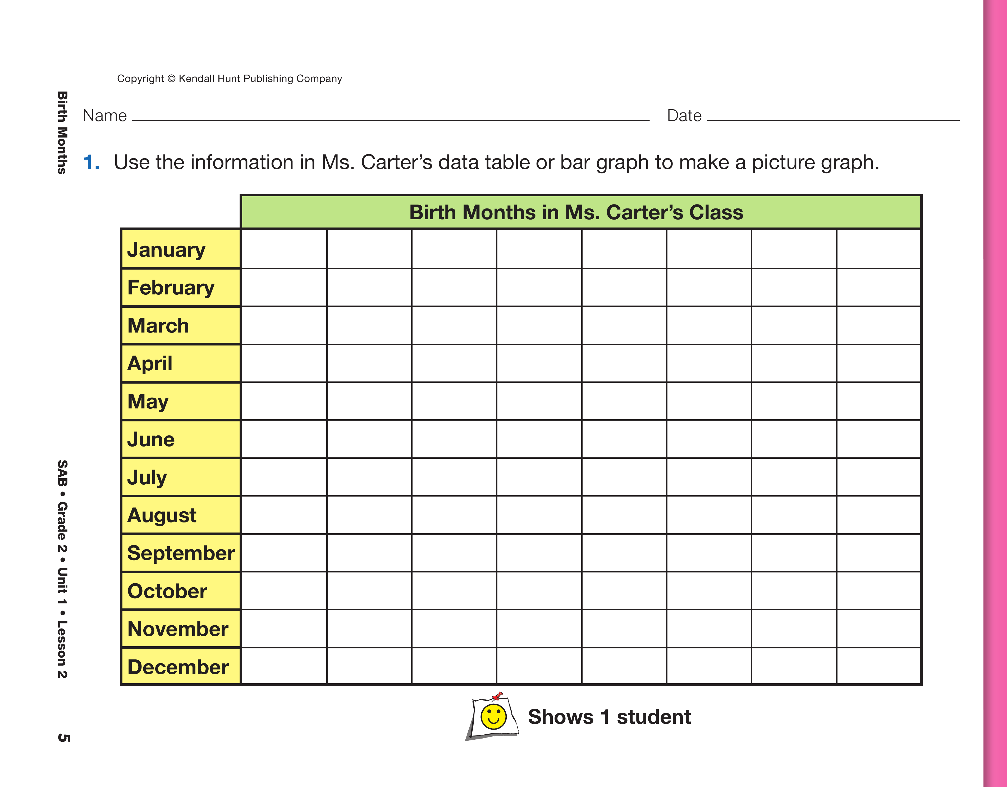
Have students complete Questions 1–4 on the Ms.
Carter's Class pages in the Student Activity Book. In
Question 1, students are asked to make a picture
graph of the data collected in Ms. Carter's class.
- What is different about a picture graph? (Pictures
represent the number of students rather than the
area shaded on the bar graph.)
- What symbol should you use for each student in
Ms. Carter's class? (a smiling face)
- Where are you going to draw those symbols? (In
each box on the blank picture graph.)
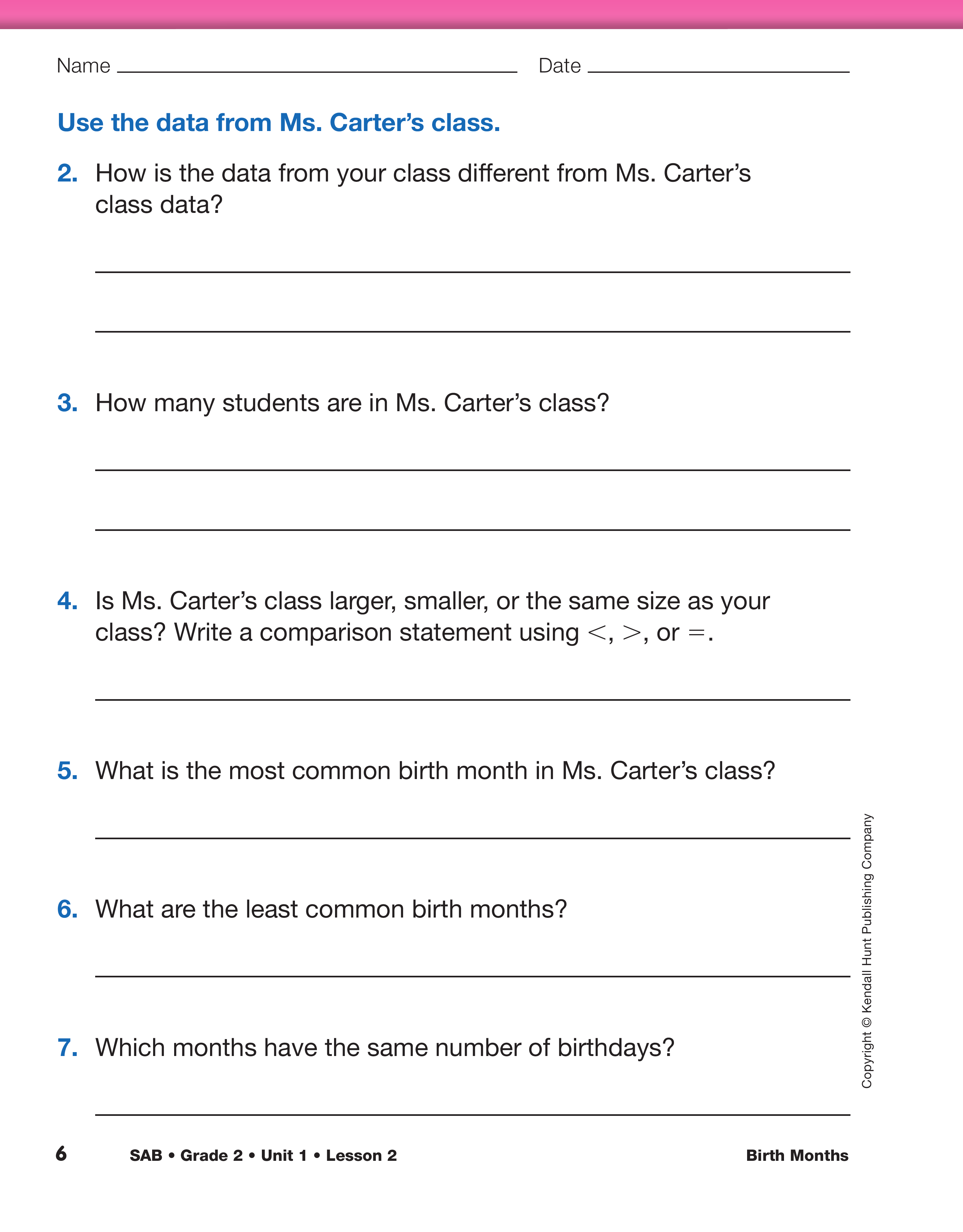
In Questions 2–4, students compare the data from
their class to the data in Ms. Carter's class.
- Where are the tallest bars on both graphs?
- Where are the shortest bars on both graphs?
- Do both classes have the most birthday's in
March?
- Do both classes have no birthdays in April and
September?
The shape and location of the data on the graph
helps students make generalizations about the data.
For example, if the taller bars are clustered together
toward the right side of the graph, the generalization
could be made that most students have birthdays in
the autumn or early winter. A graph that has shorter
bars that are closer in height would indicate that student
birthdays are mostly scattered throughout the
year.
Provide time for students to complete Questions
5–12. You may choose to have students complete the
questions individually, with a partner, as a group, or
combine these student groupings for select questions.
Have students share their solution strategies.
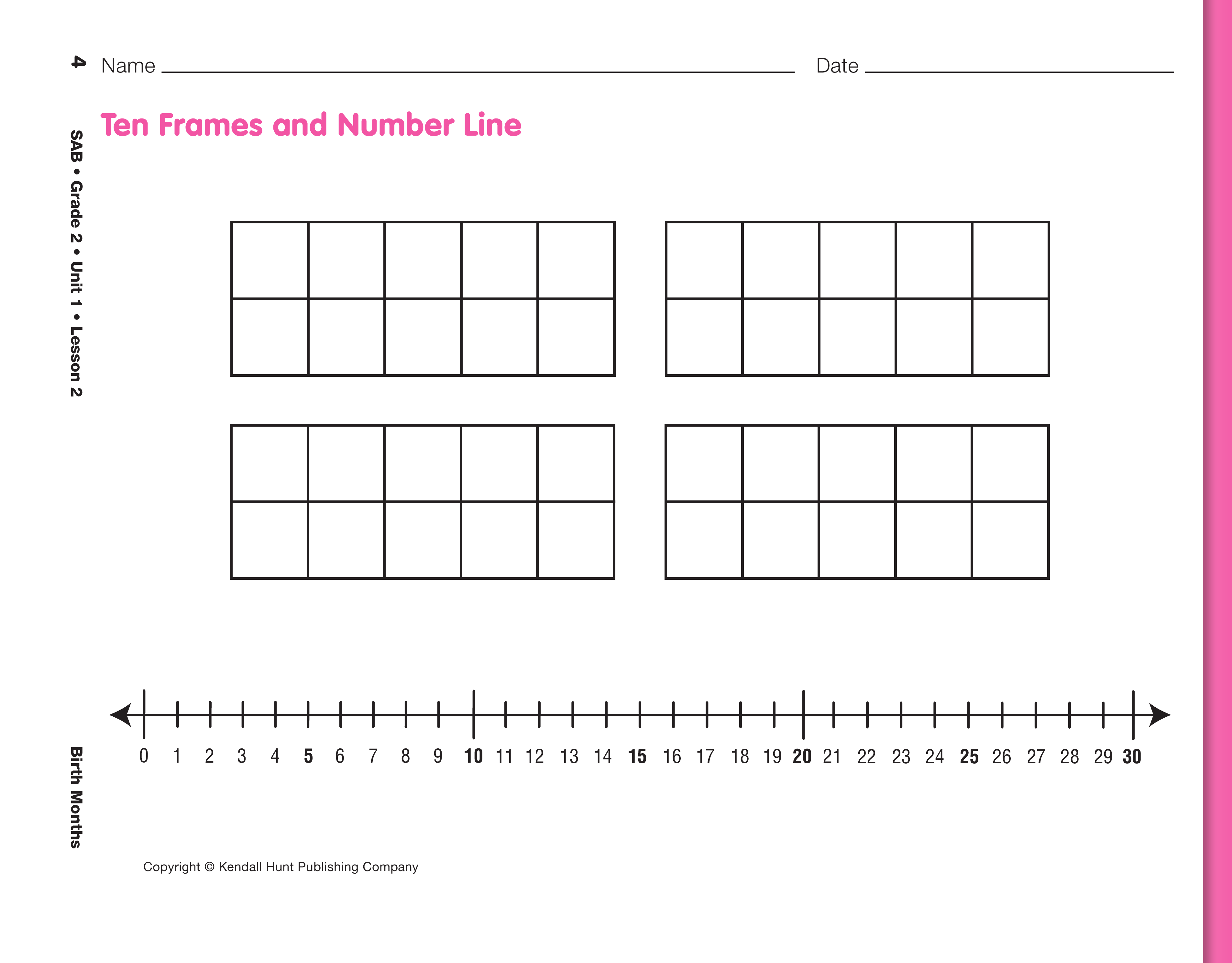
Use the Ten Frames and Number Line Display
Master, if needed.
Data from one class of students is a relatively small sample
size. As a result, the data will be fairly scattered across the
months and generalizations are not reliable. Generalizations
and analyzing trends in the data is more reliable with a larger
set of data.
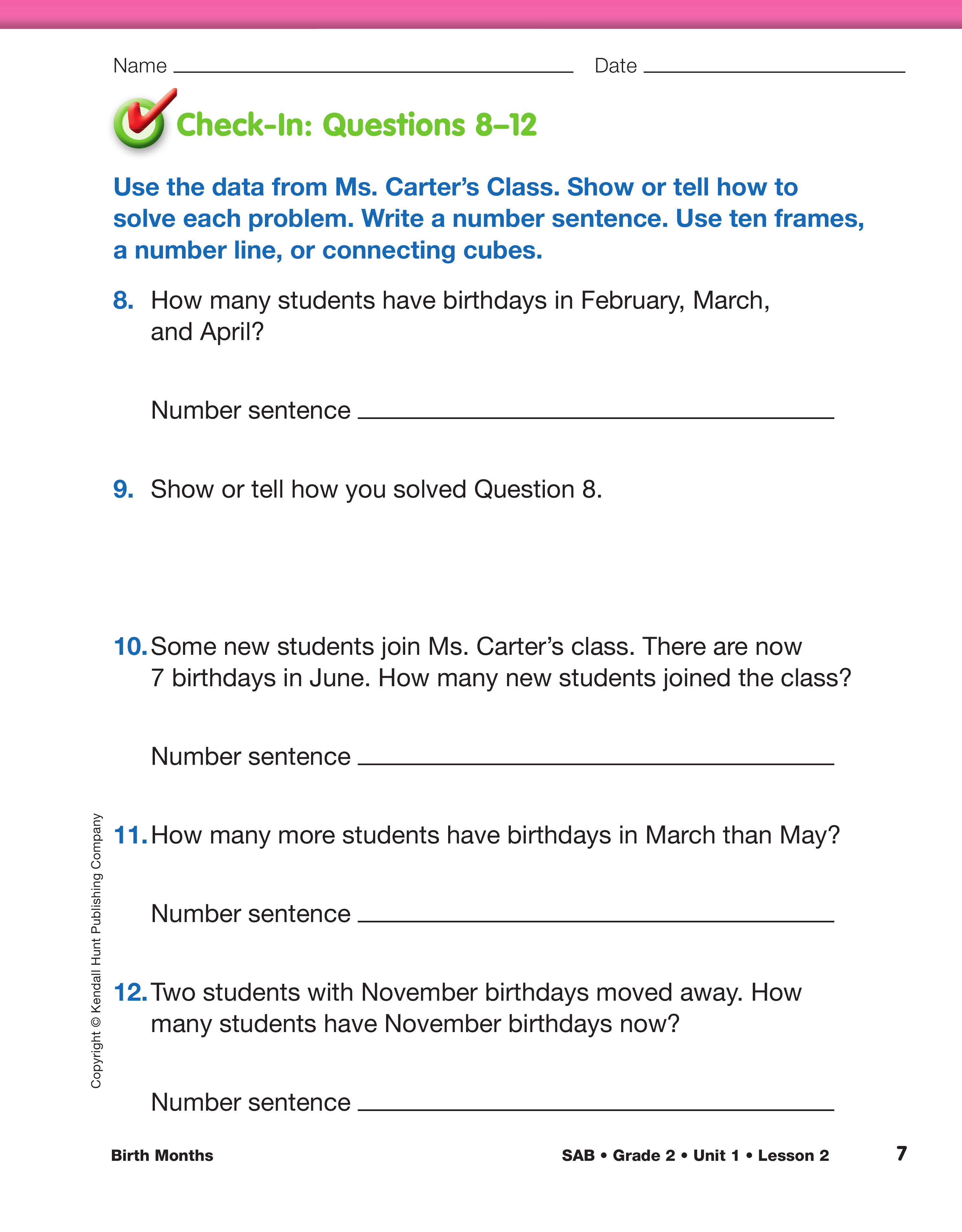
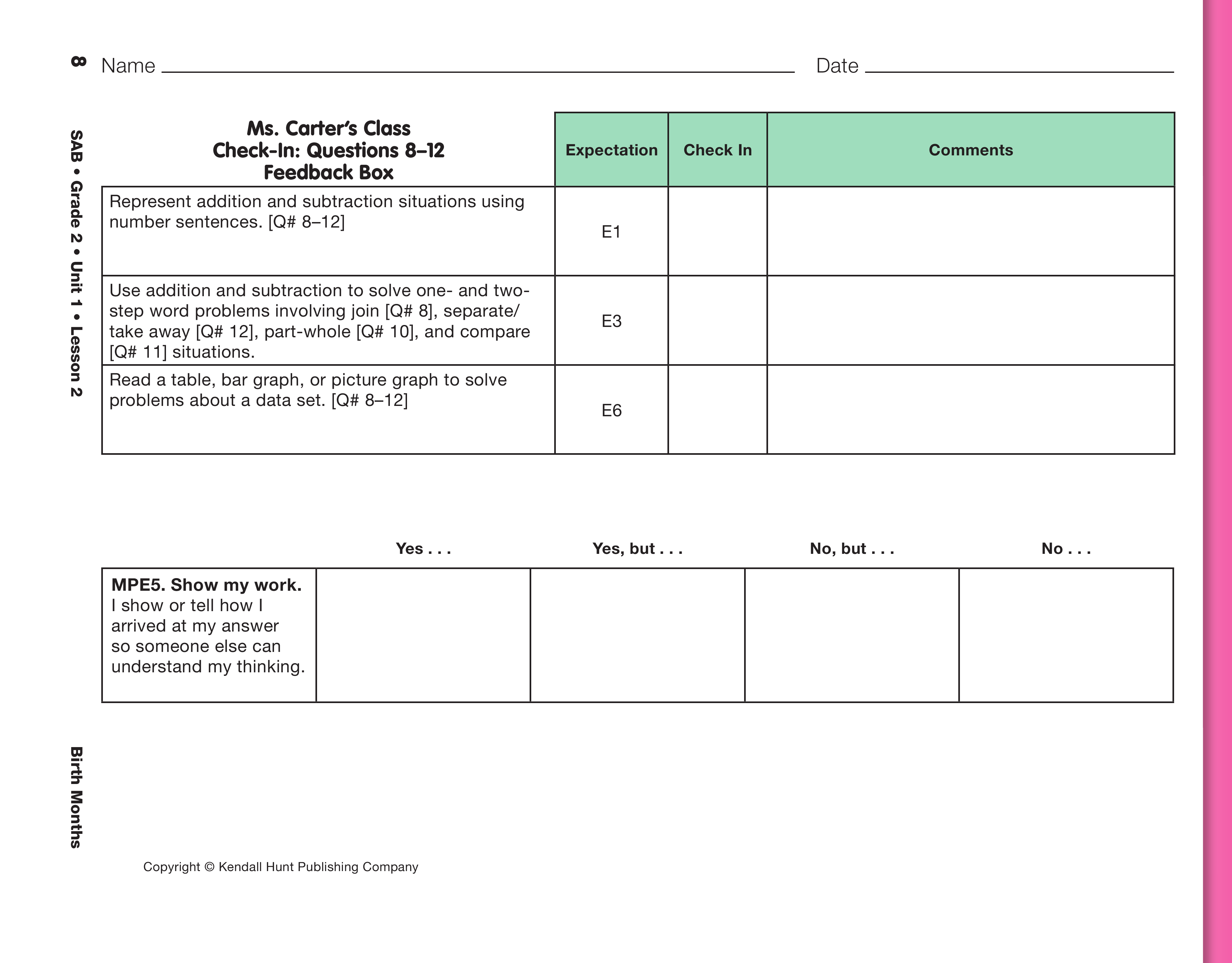
Use the Check-In: Questions 8–12 with the Feedback Box
on the Ms. Carter's Class pages in the Student Activity Book
to assess students' abilities to represent addition and
subtraction situations using multiple representations (e.g.,
counters, number sentences, stories, number lines, ten
frames) [E1]; read a table, bar graph, or picture graph to
solve problems [E6]; use addition and subtraction to solve
one- and two-step word problems involving situations of
join, separate/take away, part-whole, and compare [E3];
and show their work [E5].