


Life Spans
Est. Class Sessions: 1–2Developing the Lesson
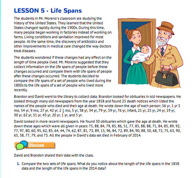
Prepare to Organize the Data. Read the vignette on the Life Spans pages in the Student Guide. Discuss the information that David and Brandon gathered at the library, beginning with Question 1. Students can see that the ages at death listed in the 1858 data range from infancy to 79 years and the life spans in the 2014 data range from 15 to 97 years.

Students may find it difficult to find trends in the data as it is listed in the Student Guide. Question 2 suggests graphing the data as a way to tell the story of the data. It also asks how to set up the graphs. Students may have many suggestions.
Help students evaluate the different methods by asking:
Figure 1 shows what the beginning of a bar graph would look like with the horizontal axis scaled by ones.
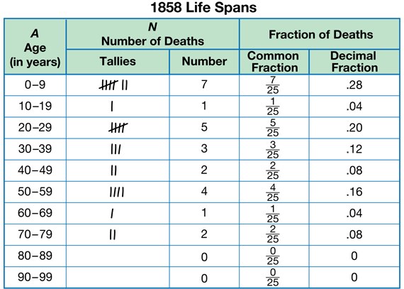
Suggest to students that they need a new way to organize the data to help them see trends in the data. In the Student Guide, Mr. Moreno suggests that students bin the data. Explain that you bin data so it will be easier to graph and so you can see patterns in the data better. As described in Question 3, ask students to look at the life span data and suggest possible intervals that can be used. One suggestion is to use intervals of 10 years. The intervals will then be 0–9 years, 10–19 years, 20–29 years, 30–39 years, and so on until there are bins for all of the data.
Question 4 asks students how they can compare data if their samples are different sizes. There are 25 life spans in the 1858 data and 50 life spans in the 2014 data. Students had some experience with this in Lesson 2. Remind students that when Lee Yah and her cousin compared data from their class survey on favorite sports, they found that they could more easily compare the data using decimals. Therefore, when you convert a fraction to a decimal, you are showing what part, out of 10 or 100, of your sample you are considering. This allows you to compare samples of different sizes accurately.

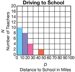
Binning Data. When there are many values and a wide range of values in a data set, it is often impractical to display the data using a bar graph without grouping the data into intervals or bins. For example, suppose a principal of a large school collects data on the number of miles teachers drive to school. He finds that the number of miles teachers drive ranges from 1 to 50 miles and no two teachers drive the same number of miles to school. It is not useful to make a bar graph with a scale of 1 to 50 miles on the horizontal axis and one bar for each different number of miles driven. The horizontal axis would be too long and all the bars would be the same height. It is better to group the data into equal intervals or, as we say, to “bin” the data. In this case, the data can be divided into intervals such as 0–9 miles, 10–19 miles, 20–29 miles, etc. Then a bar can be drawn for each interval. Note: The bars are drawn between the lines to show that the data lie within the interval. For example, the first bar tells us that ten teachers drive between 0 and 9 miles to work.
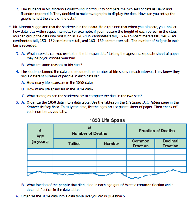
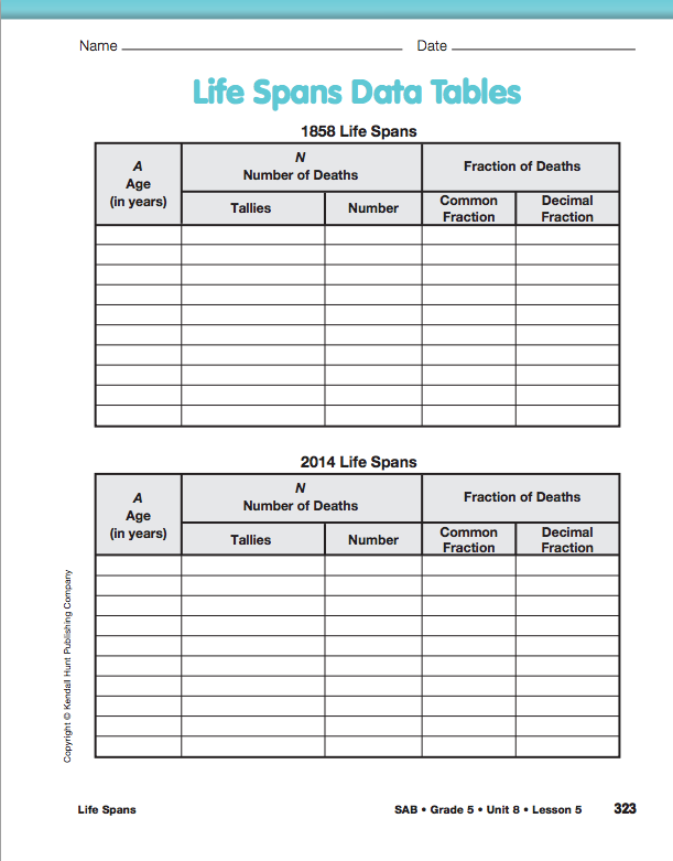
Organize the Life Span Data. In Question 5, students are directed to organize the data into bins using the Life Spans Data Tables page in the Student Activity Book. See Figure 2 for a sample completed data table for the 1858 data. Note that the intervals are the same size and that they do not overlap.
After students have had a chance to bin the data, ask:
As directed in Question 5B, ask students to write a fraction that represents the people that died in that age group.
Once students have written the common fraction, ask:
Give students time to write the equivalent decimal fractions for the data. See Figure 2.
When most students are done, ask:
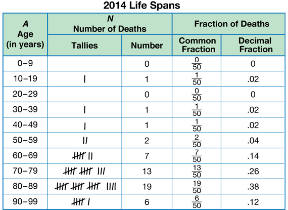
In Question 6, students are directed to organize the 2014 data as well. See Figure 3.
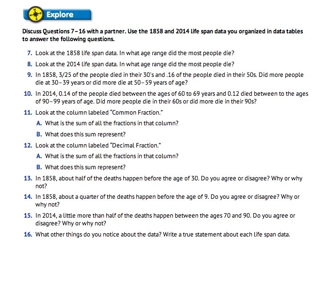
Use Data Tables to Describe the Life Span Data. In Question 7–15, students compare the life spans of the people in the data the boys collected. Organize students to discuss these questions and solutions with a partner. As students are working, circulate and identify the strategies students are using to compare the fractions, specifically in response to Questions 13–15. After most students have had a chance to work through these problems, organize students to discuss Questions 11–12.
Ask:
Discuss Questions 13–15. Ask the identified students to share the strategies they used to answer these questions.
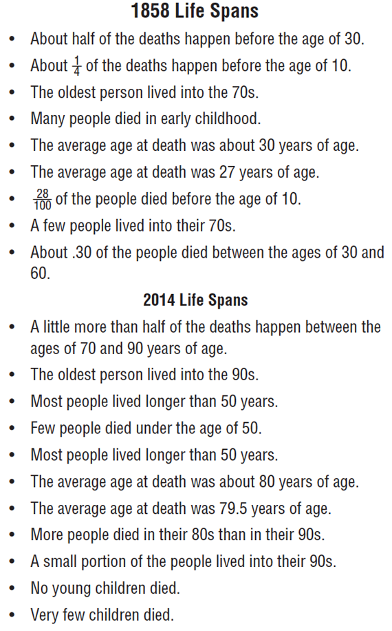
Refer students to Question 16 and ask them to work with a partner to write a statement about the data sets. Direct students to record their statement on sentence strips or a sheet of paper that can be displayed with the other statements written by their classmates.
Ask:
Ask students to read their statement to another group of students. See Figure 4 for examples of statements.
Gather and display these statements with a completed data table and graph. Students will add statements later in the lesson. These should also remain on display through Lesson 6 to serve as models and examples.

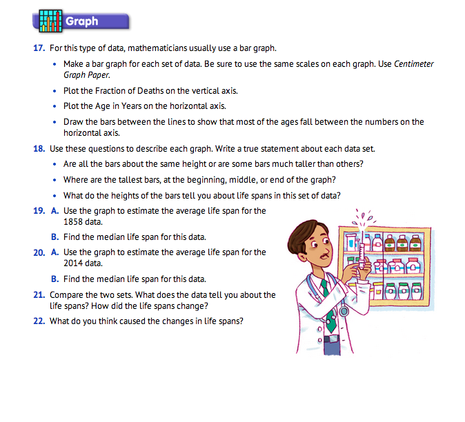
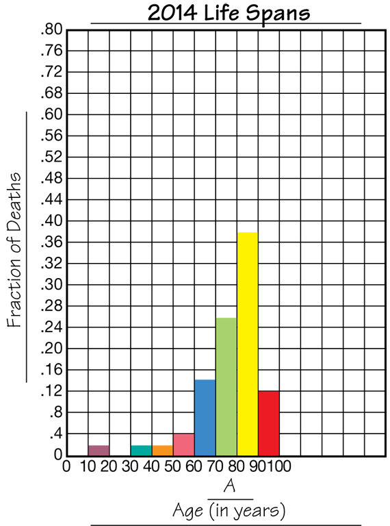
Graph the Life Span Data. Looking at the numerical patterns in the data table is one way to represent the data. A graph is another. Give each student two copies of the Centimeter Grid Paper Master and refer them to Question 17. Use a display of the Centimeter Grid Paper Master to demonstrate how to scale and label the graph. Students are directed to make a bar graph for each data set. However, this graph will be somewhat different from other bar graphs they have made. Students will graph the Fraction of Deaths on the vertical axis. Make sure that students scale this axis appropriately so both graphs use the same scale. One suggestion is to scale by 0.4 intervals. The Age in Years will be graphed on the horizontal axis. The lines of the graph will be numbered using the first number of each interval. The spaces between the lines represent the bins or intervals. Students build the bars in these spaces to show that the data falls within the interval. See Figures 5 and 6. Circulate as students are making the graphs. Display the Graphing Life Spans Master to show examples of the completed graphs.
Use Graphs to Describe the Life Span Data. As students complete their graphs, ask them to discuss Questions 18 in a small group. Encourage students to connect the location and height of the bars of the graph to the data. For example, they can say that the tallest bar at the beginning of the graph tells us that many people in the 1858 data set died in early childhood.
Ask:
Use Averages to Describe the Life Span Data. Using averages is another way to represent the data. Questions 19–20 ask students to estimate first the average life span and then find the median. Since half of the 1858 data falls within the first three bars, they can estimate that the average age at death is near 30 years old. Since most of the data is above 70 in the 2014 data, they can estimate the average age at death is around 80 years old. To find the median, students will need to order the ages from youngest to oldest and find the middle value.
Write statements using the averages and add them to the statements written and shared earlier with Question 18. See Figure 4 for possible statements.